Previously, in Part 7, the staff pages got density with dignity, and every surface of ClinicLive finally looks designed. This part asks the question no screenshot can answer: what does the app sound like? Because our proudest feature — a board that repaints the instant anything changes — is precisely the thing a screen reader cannot see.
- Commission an audit as a screen-reader user, and point it at the real-time parts
- Put
aria-live="polite"on the serving and up-next sections inBoard.razor - Add
role="status"to both kiosk outcome panels and to the chat's typing line - Add
role="log"to the chat message list - Confirm
BareLayoutkept itsmainlandmark, and add a "Skip to content".skip-linkfirst in tab order - Check the token contrast pairs: muted on porcelain about 4.7:1, board pairs 6:1 or better, danger red 6.3:1
- Turn on NVDA or VoiceOver, call the next patient from the staff queue, and listen for the board
- Compare with tag
polish-08in the repo
The proudest feature is the invisible one
Think about what ClinicLive's live board actually does. Reception clicks "call next," a SignalR message crosses the network, and the biggest text in the building changes to a new name — in under a second, with no refresh. Two seasons of work are in that repaint.
Now sit in that waiting room with a screen reader. The board updates and… nothing. A DOM mutation makes no sound. Assistive tech reads what you navigate to, not what quietly changed behind your focus — so the more "live" a surface is, the more completely a blind user is locked out of it. The kiosk's "You're in!" celebration, the chat's incoming bubbles, the typing indicator: every real-time feature we've built is, by default, a silent movie.
That's the theme of this pass, and the title of it: announce, don't just paint.
The audit prompt: findings first, again
Season one's hardening pass taught us the
move: don't ask the AI to "make it accessible" — commission an audit, in a specific
persona, and read the findings before any fix lands. The prompt, verbatim from the
polish-08 commit in
the companion repo:
"Audit ClinicLive the way a screen-reader user experiences it, then
fix what you find. Think especially about the real-time parts: a board
that updates silently is invisible to assistive tech."
The second sentence is the load-bearing one. A generic accessibility prompt returns a generic checklist — alt text, labels, heading order — and most of that we'd already covered in earlier parts. Pointing the auditor at the real-time parts aims it at exactly the class of problem automated checkers score 100 on and real users hit first. Here's what came back:
| Surface | What a screen-reader user experienced | The fix |
|---|---|---|
| Board | Names painted, never announced — a called patient hears nothing | aria-live="polite" on the serving and up-next sections |
| Kiosk | Check-in succeeds or fails invisibly | role="status" on both outcome panels |
| Chat history | New messages arrive as anonymous divs |
role="log" on the message list |
| Typing line | "reception typing…" appears and vanishes silently | role="status" on the typing paragraph |
| Standard shell | No way past the top bar without tabbing through it | A skip link, first in tab order |
Model pick: same split as season one's hostile review — Opus for the audit itself, because reading an app as someone else is exactly the kind of adversarial thinking cheap models hedge on. The fixes are attributes and one-liners; any model can type those once the findings exist.
Live regions: making updates audible
The board fix is two attributes, and understanding them is the whole lesson. An
aria-live region tells assistive tech: watch this part of the DOM, and when it
changes, speak the change — even though focus is somewhere else entirely. Here's the real
markup from Board.razor:
<section class="board-serving" aria-live="polite">
    <p class="board-label">Now serving</p>
    @if (_snapshot?.NowServing is { } serving)
    {
        <p class="board-name" @key="serving.AppointmentId">@serving.DisplayName</p>
    }
</section>

<section class="board-next" aria-live="polite">
    <p class="board-label">Up next</p>
    ...
</section>
When the SignalR handler swaps the snapshot and Blazor re-renders, the screen reader now says the new name out loud. A called patient is announced, not just painted — the feature finally works for everyone it was built for.
Why polite and not assertive? Polite waits for the current speech
to finish; assertive interrupts mid-sentence. A clinic board should tap you on the
shoulder, not shout over whatever you were reading. Assertive is for "the building is on
fire," and almost nothing you build is that.
The other three fixes are the same idea wearing role hats. role="status" is a
built-in polite live region — perfect for the kiosk, where the outcome of a check-in
is the entire point of the surface:
<div class="kiosk kiosk-success" role="status">
    <div class="kiosk-emoji" aria-hidden="true">🪑</div>
    <h1>You're in!</h1>
    <p class="kiosk-position">Number <strong>@_result.Position</strong> in the queue</p>
    ...
The gentle error panel carries the same role, so a failed code is spoken too. And the chat
gets role="log" — a live region that assumes additions at the end and reads
only the new entry, which is exactly what a chat is — plus a status role on the typing
line:
<div class="chat-log" role="log" aria-label="Messages" @ref="_log">
    ...each message...
</div>

<p class="chat-typing" role="status">
    ...who's typing...
</p>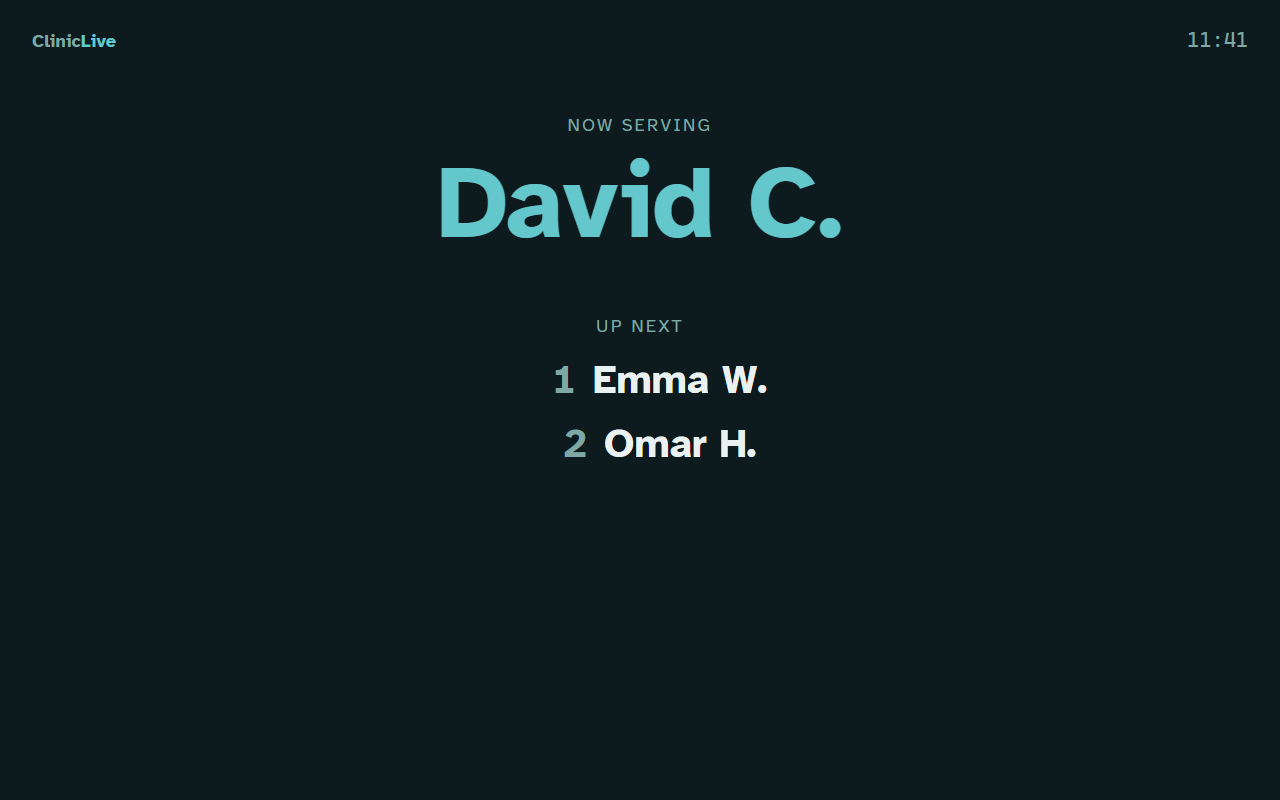
Chrome-free is not landmark-free
Part 2 gave the kiosk and board a
chrome-free BareLayout — appliances don't need nav bars. The audit's job was
to check that stripping the chrome didn't strip the semantics, and here the news was good.
The layout had kept its landmark, and the comment in the real file says why:
@* Chrome-free layout for "appliance" surfaces: the check-in kiosk and the
   waiting-room board. A TV on a wall does not need a nav bar — but it is
   still a document: <main> keeps the landmark for assistive tech. *@
@inherits LayoutComponentBase

<main class="appliance">
    @Body
</main>
Landmarks — main, header, nav — are how
screen-reader users jump around a page instead of arrow-keying through it. Deleting the
visual chrome is a design decision; deleting the document structure would be a regression.
Chrome-free is not landmark-free.
The standard shell got the classic companion: a skip link, the first focusable thing on every page, invisible until keyboard focus lands on it:
<a class="skip-link" href="#main-content">Skip to content</a>.skip-link {
position: absolute; left: var(--s-4); top: -4rem; z-index: 50;
background: var(--primary); color: var(--on-primary);
padding: var(--s-2) var(--s-4); border-radius: 0 0 var(--radius) var(--radius);
transition: top 120ms ease;
}
.skip-link:focus { top: 0; text-decoration: none; }Parked above the viewport, it slides down on focus. Mouse users never meet it; keyboard users meet it first. That asymmetry is the entire trick.
The contrast audit: the tokens pay their rent
Because every color in ClinicLive is a token, auditing contrast means checking a short list of pairs once — not hunting hex codes across forty files. The numbers, from the audit:
- Muted text on porcelain — the riskiest pair, since "muted" tempts designers below the line — sits at ≈ 4.7:1, clear of the 4.5:1 AA threshold for body text.
- The board pairs — pale cyan on deep teal, read from five meters — all land at 6:1 or better. Signage gets headroom, not minimums.
- Danger red on surface — the color that appears when something is already going wrong — measures 6.3:1. Error text is the worst possible place to be barely legible.
And a choice made in Part 1 pays off here: the site's typeface is Atkinson Hyperlegible, developed by the Braille Institute specifically for low-vision readers — unambiguous letterforms, generous counters. We picked it back then partly because its story fit a clinic. In the accessibility part, the story turns out to be load-bearing: the type was doing audit work all along.
Accessibility is a thread, not a part
Here's the quiet good news from the audit: most of the list was already done, because it
never belonged to a single part. Part 4
added autocomplete and type="tel"/type="email" to
the booking form — phone-keyboard ergonomics that are also assistive-tech semantics.
Part 2 built the focus-visible rings and
the reduced-motion guard into the foundations — and its very first screenshot catch, the
h1 wearing a focus ring, was accessibility plumbing
(FocusOnNavigate) surfacing in the visual design. A dedicated accessibility
part that discovers fifty problems is a symptom; a pass that mostly verifies is
the goal. Treat accessibility as a thread through every part, and the audit becomes a
checkpoint instead of a rescue.
What the AI got wrong: nothing in this part's diff — and that's the trap worth logging. The same AI that fixed every finding in one session had also built every silent surface across seven parts without once volunteering "screen readers can't see this." Asked to build, it builds; accessibility arrives only when you commission it, exactly like season one's security pass. If the audit isn't on your checklist, it isn't happening — the model won't put it there for you.
The meter: ≈ $3.20 total for the redesign so far. The audit conversation and the attribute fixes added about $0.30 — live regions are close to free once someone thinks to ask for them. The expensive part was building surfaces worth announcing; the announcing itself is a rounding error.
Checkpoint: git checkout polish-08, run the app, and turn
on a screen reader — NVDA is free on Windows, VoiceOver is built into macOS. Open the
board, call the next patient from the staff queue in another tab, and listen. The name
should be spoken without you touching a key. Then Tab once on any staff page and watch
the skip link drop in.
The app now announces its changes to ears. Next, we make it explain them to eyes — with
motion that has three hard rules, a Blazor @key trick that turns plain CSS
into an update cue, and the only eight lines of JavaScript in the entire redesign:
Part 9: micro-interactions — motion that
explains change.