Previously, in Part 1, we photographed the template look, made the AI propose four real directions, and — after a human veto — landed on porcelain & petrol. Now the rebuild starts from the bottom: this part ships the tokens every later part will spend, gets dark mode almost for free, and deletes Bootstrap without breaking a single page.
- Prompt with four numbered clauses: tokens, delete Bootstrap but keep its vocabulary, a top bar, chrome-free appliances
- Build a token-based
app.css: every color, size and radius a custom property under:root - Get dark mode by re-pricing the tokens under
@media (prefers-color-scheme: dark), never per component - Grep the components for the Bootstrap classes in use (about forty), reimplement that subset on the tokens, then delete Bootstrap
- Replace the sidebar with a sticky top bar, and render
/kioskand/boardthrough a layout that is only<main class="appliance"> - Screenshot every surface, then fix what shows: scope the focus ring, restore
#blazor-error-ui { display: none }, tighten the bar under 640px - Flip the OS between light and dark, and confirm the season-one tests are still 9-for-9
- Compare with tag
polish-02in the repo
The prompt: four clauses, four jobs
Here it is, verbatim from the commit in
the repo (tag
polish-02):
"Direction is 'Calm Practice: porcelain & petrol' (cool porcelain bg,
petrol teal primary, coral accent, Atkinson Hyperlegible). Build the
foundation: (1) a token-based app.css — every color/size/radius a custom
property, dark mode by redefining tokens under prefers-color-scheme,
never per-component; (2) DELETE Bootstrap but keep its class vocabulary —
grep which classes the app actually uses and reimplement exactly that
subset on our tokens, so every page compiles unchanged; (3) replace the
sidebar with a calm top bar; (4) the kiosk and board are APPLIANCES —
give them a chrome-free layout with no navigation at all."
Four numbered clauses, and they are the four sections of this post. Notice what the prompt does not say: "make it beautiful." Part 1 spent its budget deciding what beautiful means here; this prompt only spends decisions that are already made. That's the rhythm the whole season runs on — taste up front, execution to order.
Model pick: Opus, high effort, for the token system — naming and pricing a design system is structure-and-taste work, and bad token names are forever. The vocabulary CSS that followed went to Sonnet: forty small, precisely specified classes is exactly the shape of work a cheaper model does perfectly.
Tokens: components spend, never invent
The stylesheet opens with its own constitution — this comment ships in
app.css, not in a wiki nobody reads:
/* ============================================================
   ClinicLive design system — "Calm Practice: porcelain & petrol"

   Rules of the house:
   - Every color, size and radius is a token. Components never
     invent values; they spend tokens.
   - Light and dark are the same system: dark redefines tokens,
     components don't change.
   - We keep Bootstrap's class VOCABULARY (btn, form-control,
     alert…) but the implementation is ours — the markup kept
     compiling the day Bootstrap left.
   ============================================================ */
"Components spend tokens, never invent values" is the sentence doing the most work. A
component that invents #ddd once will invent it twice, slightly differently,
and dark mode dies by a thousand hardcodes. Here's the real block, abbreviated:
:root {
    /* surfaces */
    --bg: #F5F8F8;            /* porcelain */
    --surface: #FFFFFF;
    --line: #DCE5E5;

    /* text */
    --ink: #182A2D;
    --muted: #5A6E71;

    /* brand */
    --primary: #16696F;       /* petrol teal */
    --on-primary: #FFFFFF;
    --primary-soft: #E3EFEF;

    /* meaning */
    --ok: #3E8460;
    --warn: #C96F4A;          /* soft coral/clay */
    --danger: #B4473C;

    /* type */
    --font: "Atkinson Hyperlegible", system-ui, sans-serif;

    /* shape & depth */
    --radius: 10px;
    --radius-lg: 16px;
    /* …spacing scale, shadows, mono stack… */
}

@media (prefers-color-scheme: dark) {
    :root {
        --bg: #101B1D;
        --surface: #182527;
        --ink: #E4EDEC;
        --primary: #4FB3B8;
        --on-primary: #0C2224;
        /* …every token re-priced; no component touched… */
    }
}
And that second block is dark mode. Not a feature, a re-pricing: the same system
with different numbers, delivered under prefers-color-scheme, and every
component that spends var(--bg) follows along without knowing anything
happened. Note --on-primary flipping to dark ink — in dark mode the primary
lightens to #4FB3B8, so the text on it must darken to keep contrast. That's
the kind of pairing tokens make thinkable and hardcodes make hopeless. One deliberate
exception is coming: the waiting-room board will pin its own palette in
Part 6, because a TV on a wall doesn't
follow anyone's OS theme.
Killing Bootstrap, keeping its vocabulary
Here's the centerpiece. The usual redesign failure mode is the flag day: rip out the old
framework, and every page is broken until every page is restyled — so the redesign stalls
at eighty percent forever. The trick that avoids it: the markup keeps speaking
Bootstrap; only the implementation changes. Grep the components for the classes actually in
use, dedupe, and you get the app's true vocabulary — the inventory came back with about
forty names: btn, btn-primary, form-control,
form-floating, alert, badge, table, and
a modest pile of utilities. Then reimplement exactly that subset on the tokens:
/* Bootstrap's names, our implementation */
.btn-primary   { background: var(--primary); color: var(--on-primary); box-shadow: var(--shadow); }
.alert-success { background: var(--ok-soft); border-color: var(--ok); }
.form-control:focus { border-color: var(--primary); box-shadow: 0 0 0 3px var(--primary-soft); }
Forty classes instead of Bootstrap's thousands, every one of them spending tokens, and
every page compiled the day Bootstrap left — no flag day, no eighty-percent purgatory. To
be clear, this isn't a Bootstrap diss; the vocabulary is genuinely good, which is why it's
worth keeping. It's a migration strategy: the old names are scaffolding, and as the season
refines each surface, purpose-built classes (slot-btn, ticket,
kiosk-code) will quietly replace them where it matters.
The shell: a top bar and two appliances
The sidebar was the most template thing about the template — seven links of chrome for an app whose public visitors need exactly two (book, cancel) and whose staff need a sign-in. It became a calm top bar: brand left, links right, sticky, done. But the better decision is clause four. The kiosk and the board aren't pages a user browses — they're appliances bolted to a counter and a wall. They now render through a layout with no navigation at all, and its header comment is the design rationale:
@* Chrome-free layout for "appliance" surfaces: the check-in kiosk and the
   waiting-room board. A TV on a wall does not need a nav bar — but it is
   still a document: <main> keeps the landmark for assistive tech. *@
@inherits LayoutComponentBase

<main class="appliance">
    @Body
</main>
And notice what this does to Part 1's embarrassing bug: the TV's 404ing Register link isn't fixed by deleting a link — it's fixed by an architecture in which the board cannot have links. Season one learned this exact lesson with the registration page itself: delete the surface, not the link. Same move, one level up.
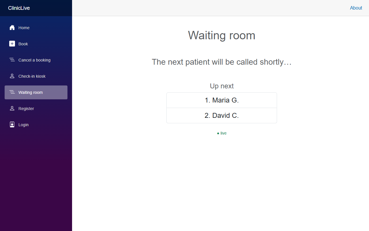 Before
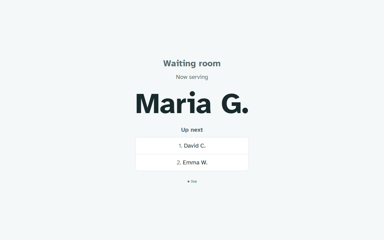 After
AfterWhat the screenshots caught
The after-shoot ran the moment the foundation compiled, and it earned its keep three times before any human review. Catch one is sitting in the home-page shot, in plain sight:
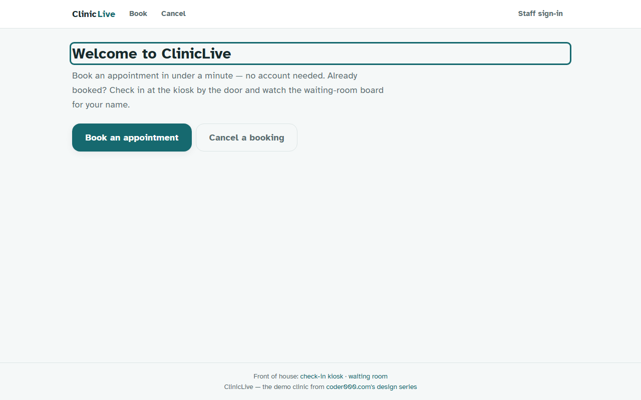
Why would an h1 have a focus ring? Because the Blazor template's
FocusOnNavigate moves focus to the heading on every navigation — genuinely
good behavior, it's how screen-reader users learn the page changed — and our shiny new
global :focus-visible rule dutifully outlined anything focused. Both
rules correct; the combination absurd. The fix scopes the ring to elements where focus
means action, and it ships with its story attached:
/* Ring only where focus is an ACTION. The template's FocusOnNavigate moves
   focus to the h1 on every navigation (good for screen readers) — a global
   ring would draw a teal box around every page title. Screenshot caught it. */
:is(a, button, input, select, textarea, summary, [tabindex]):focus-visible {
    outline: 3px solid var(--primary);
    outline-offset: 2px;
}
h1:focus { outline: none; }
Catch two was better. With the template CSS deleted, every page — every single one —
greeted visitors with a yellow bar reading "An unhandled error has occurred." No
error had occurred. The template's stylesheet had been quietly carrying
#blazor-error-ui { display: none } all along: the banner
is always in the markup, hidden by CSS, un-hidden by Blazor's JavaScript when a real error
happens. Delete the stylesheet, inherit the job it was doing. Our replacement keeps the
contract and documents it:
/* The template's stylesheet quietly carried `#blazor-error-ui { display:none }`.
   Delete the template CSS and the "hidden" error banner greets every visitor —
   found by screenshot, of course. Blazor's JS un-hides it on a real error. */
#blazor-error-ui {
    display: none;
    position: fixed; bottom: 0; left: 0; right: 0;
    background: var(--warn-soft);
    border-top: 2px solid var(--warn);
}
Catch three: at 375px the elegant top bar wrapped into three awkward rows. The fix tightens instead of stacking, behind one small breakpoint:
/* small screens: the bar tightens instead of stacking */
@media (max-width: 640px) {
    .topbar-inner { gap: var(--s-2); padding: var(--s-1) var(--s-3); }
    .topnav a, .topnav .linklike { padding: var(--s-2); font-size: 0.9rem; }
}What the AI got wrong: all three catches were in CSS the AI had just written and would happily have declared finished — and none of them are visible in the code. The focus ring was two correct rules colliding; the error banner was a job the deleted stylesheet had never advertised it was doing; the three-row bar was just arithmetic nobody ran at 375. The lesson of the part: the invisible parts of a template are still load-bearing. When you delete a template's CSS, you inherit every quiet job it was doing — and only a photograph tells you what those were.
The meter: ≈ $1.10 on season two's running meter. The token system and the forty-class vocabulary rebuild were most of it; the three screenshot fixes were one-liners that cost more to photograph than to fix — which is the correct ratio.
Checkpoint: git checkout polish-02 in
the repo: the Bootstrap
stylesheet is gone and every page still compiles; flip your OS between light and dark
and watch the whole app re-price itself; /kiosk and /board
render chrome-free — no Register link left to 404. The season-one test suite is still
9-for-9: a redesign that never touched behavior.
Three bugs in this part alone were found by photographs, not by reading code — and so far the "loop" is just a folder of PNGs and good intentions. Time to make it a tool: one command, every surface at its natural device size, state seeded so the shots have life in them — Part 3: The screenshot loop: letting the AI see its own work.