Previously, in Part 2, we shipped the token foundation — and three of that part's bugs were caught by screenshots, not by anyone reading code. Season one had a rule: every claim about behavior gets a test. This part builds the same discipline for pixels. The AI can read screenshots — so screenshots can be the design test suite.
- Prompt for a small Playwright console app at
tools/shotsthat photographs every surface at its natural device size - Create three browser contexts: phone 375x812, tablet 768x1024, desktop 1280x800
- Write one
Shothelper: go to the URL, wait forNetworkIdle, nap 600 ms for the circuit, save the PNG - Sign in through the real
/Account/Loginform asreception@cliniclive.testfor the staff pages - Add flags that make state through the app's own front doors:
--checkin,--callnext,--chat - Run it:
dotnet run --project tools/shots -- shots/my-set http://localhost:5391 --checkin DEMO00,DEMO11 --callnext --chat "hello" - Hand the before and after folders to the model (what looks wrong, worst first, no code yet) and commit
shots/ - Compare with tag
polish-03in the repo
The prompt: a camera, not a critic
Verbatim from the commit in
the repo (tag
polish-03):
"I want a repeatable way to SEE every surface after each change — the AI
can read screenshots, so screenshots become the test suite for design.
Build a small Playwright console app: captures every surface at its
natural device size (phone 375 for booking, tablet 768 for the kiosk,
1280 for the board and staff), logs in as reception for the staff pages,
and can seed queue state (check-ins, call-next) and a chat message so
the shots have life in them. One command, ten screenshots, before and
after every part."
Two clauses carry the design. Natural device size: photographing everything at desktop width would test a fiction — nobody books from a 1280px browser in a hurry, and no TV is 375 wide. Each surface gets photographed as the device it actually lives on. And so the shots have life in them: an empty queue and a blank chat produce beautiful, useless screenshots. Empty states lie about a design. The harness makes state before it makes pictures.
The harness
It lives at tools/shots in the repo — a single-file Playwright console app,
deliberately dumb. Three browser contexts, one per device:
var phone   = await browser.NewContextAsync(new() { ViewportSize = new() { Width = 375,  Height = 812 } });
var tablet  = await browser.NewContextAsync(new() { ViewportSize = new() { Width = 768,  Height = 1024 } });
var desktop = await browser.NewContextAsync(new() { ViewportSize = new() { Width = 1280, Height = 800 } });
One helper does all the photography:
async Task Shot(IBrowserContext ctx, string path, string name, bool fullPage = false)
{
    var page = await ctx.NewPageAsync();
    await page.GotoAsync($"{baseUrl}{path}", new() { WaitUntil = WaitUntilState.NetworkIdle });
    await page.WaitForTimeoutAsync(600); // let Blazor circuits settle
    await page.ScreenshotAsync(new() { Path = Path.Combine(outDir, $"{name}.png"), FullPage = fullPage });
}

await Shot(desktop, "/", "home-desktop");
await Shot(phone,   "/book",  "book-phone", fullPage: true);
await Shot(tablet,  "/kiosk", "kiosk-tablet");
await Shot(desktop, "/board", "board-tv");
The staff pages sit behind login, so the harness signs in the way a human does — through the real form, with the seeded demo account (which means the login page gets photographed for free):
await login.GotoAsync($"{baseUrl}/Account/Login", new() { WaitUntil = WaitUntilState.NetworkIdle });
await login.FillAsync("input[name='Input.Email']", "reception@cliniclive.test");
await login.FillAsync("input[name='Input.Password']", "Clinic!Live1");
await login.ClickAsync("button[type='submit']");
And the flags make state through the app's own front doors, never behind its back:
--checkin DEMO00,DEMO11 types real codes into the real kiosk,
--callnext presses the real button on the staff queue, --chat
posts a real message. So the screenshots double as a smoke test — if check-in breaks, the
photo shoot fails before the design review starts. (In Part 4 the harness learns one more
trick, --book, because the booking confirmation will become worth
photographing.)
Model pick: Sonnet for the harness — a small Playwright console app is bread-and-butter code with no taste decisions in it. The interesting model choice moved elsewhere: to whoever reads the shots. Hunting for wrong-and-inconsistent works fine on the cheap model; the judgment calls that follow go to Opus, and the final call stays human.
One command, ten screenshots
dotnet run --project tools/shots -- shots/my-set http://localhost:5391 \
    --checkin DEMO00,DEMO11 --callnext --chat "hello"
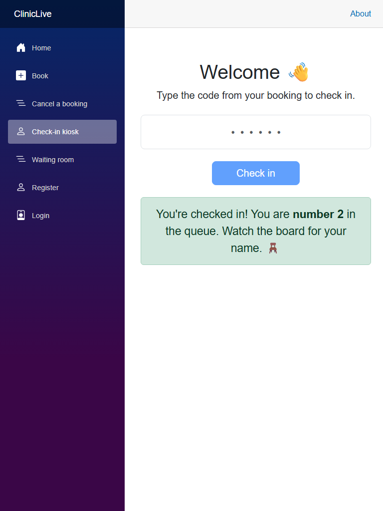
Ten PNGs land in the folder: home, booking on a phone, cancel, the kiosk idle and
checked-in, the board, the login page, appointments, the queue, and chat with a live
message in it. The loop each part runs is now mechanical: shoot a before set, make
the change, shoot an after set, and hand both folders to the model with a job
description — the same findings-first shape as
season one's hostile review, pointed at
pixels: describe what looks wrong, inconsistent or unfinished, worst first, and don't
touch any code yet. The shots/ folder is committed to the repo on purpose. It
is the series' evidence — every before/after in these posts comes from it, and you can
re-run the camera on any tag and check.
The receipts
Three parts in, the loop already has a record. Everything on this list shipped in code the AI had read many times — and every one was caught by a photograph, none by reading code:
| # | What the shot showed | Why code review kept missing it |
|---|---|---|
| 1 | The waiting-room TV offering a Register link that 404s | A link to a deleted page is valid markup; it's only wrong on a television |
| 2 | The kiosk refusing every demo code — "No appointment found" | The seeded data had aged out; correct behavior, dead demo. No review reads a calendar |
| 3 | A teal focus ring hugging every page title | Two individually correct rules — FocusOnNavigate plus a global focus style — colliding |
| 4 | "An unhandled error has occurred" greeting every visitor | The deleted template CSS had been quietly hiding the banner all along |
| 5 | The top bar stacked into three rows at 375px | Layout arithmetic nobody runs in their head at phone width |
What the AI got wrong: every bug in that table is the AI's own work, and the same model re-read those files across two seasons of reviews — the test-writing pass, the hostile security pass — and saw nothing, because there was nothing to see in the text. That's not a model weakness to prompt your way around; it's a modality gap. Code review answers "is this code right?" A screenshot answers "is this what a person sees?" Different questions, different instruments. The loop doesn't replace review; it covers review's blind spot.
What the loop can't see
Honesty section, because this technique is having a moment and deserves accurate press. The AI's eye is genuinely good at wrong and inconsistent: misalignment, contrast, overflow, spacing that disagrees between pages, a control that shouldn't exist on that surface. It is measurably weaker at taste — it will tell you the board's type scale is uneven; it will not tell you the board feels institutional. Direction stays human; Part 1 was the proof.
And a screenshot is one frame. It captures no motion, no hover states, no focus order, no scroll feel, none of the timing that Part 9 will care about. A page can photograph beautifully and feel broken. So the boring rule stands: the human still looks at every shot. The camera made looking cheap — ten surfaces in thirty seconds instead of ten minutes of clicking — but it didn't make looking optional.
Pointing it at your own app
The harness is maybe eighty lines and none of them are clever — which is the point. If you adapt it, these are the parts to parameterize:
- The surface list — every URL that renders meaningfully differently, each at the device it really lives on. One desktop pass over everything tests a fiction.
- Auth — a seeded demo account in your dev environment, signed in through the real login form. Never real credentials; the harness's account should be as fake as its patients.
- State seeding — flags that create state through the app's own UI
(our
--checkindrives the actual kiosk) rather than writing to the database behind its back. Empty states lie, and front-door seeding makes the shoot a smoke test for free. - Output discipline — one folder per set, named for the moment
(
shots/before,shots/part02-foundations), committed. The befores are the evidence you'll want later, and the afters become the next befores. - Keep it dumb — no assertions, no pixel-diffing, no cleverness. It's a
camera. The reasoning happens when you hand the folder to the model, or to your own
eyes. (Ours even keeps a confessed hack:
WaitForTimeoutAsync(600)to let Blazor circuits settle — a nap, not a guarantee, and an honest one.)
The meter: ≈ $1.30 on season two's running meter. The harness itself was one prompt and small change; the recurring cost is the screenshot-reading passes, and they're small too. The scarce resource this part spends isn't tokens — it's your minutes per shot, which is exactly what the one-command shoot is designed to protect.
Checkpoint: git checkout polish-03 in
the repo, run the app, then
run the one command above: ten PNGs, every surface at its natural size, queue seeded
and chat alive. Compare your folder against the committed shots/ sets —
the series' claims are all checkable against that folder.
The foundation is tokened, the camera is loaded. Now the redesign proper: one surface per part, each as its own UX discipline — starting with the hardest audience in the building, a stressed parent holding a phone in one hand and a sick kid in the other — Part 4: Phone UX: the booking flow and the ticket.