Second stop on the four-surface tour, and the question that opens every part — who uses this, in what physical situation? — gets its sharpest answer yet. The kiosk is used standing up, in a lobby, by strangers — people who have never seen this screen before, will use it for nine seconds, and may be doing it with a toddler on one arm. Part 4's booking page could lean on the patient's own phone and autofill. The kiosk gets none of that. Every kiosk user is a first-time user, and the design has exactly one job: be impossible to get wrong.
- Prompt for strangers standing up: the code input is the whole show, a success takeover, a self-reset, gentle errors
- Style
.kiosk-code: 3rem mono,letter-spacing: 0.35em, uppercase, and 0.35em of left padding to re-center it - Bind with
@bind:event="oninput"andmaxlength="6", and keep the button disabled until six characters - On success, swap in the
.kiosk-successtakeover: "You're in!", the queue position huge, one instruction - Reset after eight seconds with
Task.Delayand aCancellationTokenSource, cancelled inDispose() - Give every error the same escape hatch: "Stuck? The front desk is right there"
- Test at tablet width: a lowercase code uppercases, the takeover shows, the screen resets, a wrong code gets gentle words
- Compare with tag
polish-05in the repo
Follow along: git checkout polish-05 in
the companion repo — the commit message is
the prompt.
The prompt
Verbatim, from the commit "Kiosk: giant code entry, success takeover, auto-reset":
The kiosk is used standing up, by strangers, possibly with a toddler
on one arm. Make the code input the whole show: huge mono type, wide
letter-spacing, auto-uppercase. On success, take over the entire
screen — celebrate, show their queue position enormous, tell them what
to do next — then reset by itself after a few seconds, because the
next patient is already walking up. Errors must never feel like the
machine's fault: gentle words and point them at the front desk.Model pick: Sonnet again — the CSS and the takeover are execution work. But note where the best idea in this part came from: the auto-reset wasn't in any style guide. It fell out of asking "who uses this surface, and what state do they find it in?" That question is free, and it out-designs the model every time you ask it.
The code input is the whole show
A kiosk screen has one task: get six characters from a paper ticket into a box. So the box is the page — 3rem mono type, wide letter-spacing, auto-uppercase so nobody hunts for a shift key:
.kiosk-code {
    display: block; width: 100%; margin: var(--s-5) 0;
    font-family: var(--mono); font-size: 3rem; font-weight: 700;
    text-align: center; letter-spacing: 0.35em; text-transform: uppercase;
    color: var(--ink); background: var(--surface);
    border: 2px solid var(--line); border-radius: var(--radius-lg);
    padding: var(--s-4) 0 var(--s-4) 0.35em; /* left pad balances letter-spacing */
}
That last line is a small trick worth stealing. letter-spacing adds its gap after
every character — including the last one — so a centered string carries an invisible trailing space and
sits visibly left of optical center. At 0.35em spacing the drift is obvious. The fix: one letter-space
of left padding pushes the glyphs back to true center. The markup stays boring on purpose — a
dotted placeholder showing exactly six slots, and a button that won't fire until there are six
characters to send:
<input class="kiosk-code" maxlength="6" autocomplete="off" spellcheck="false"
aria-label="Your six-character confirmation code"
@bind="_code" @bind:event="oninput" placeholder="······" />
<button class="btn btn-primary btn-lg kiosk-go" @onclick="CheckInAsync"
disabled="@(_code.Length < 6 || _busy)">
@(_busy ? "One moment…" : "Check in")
</button>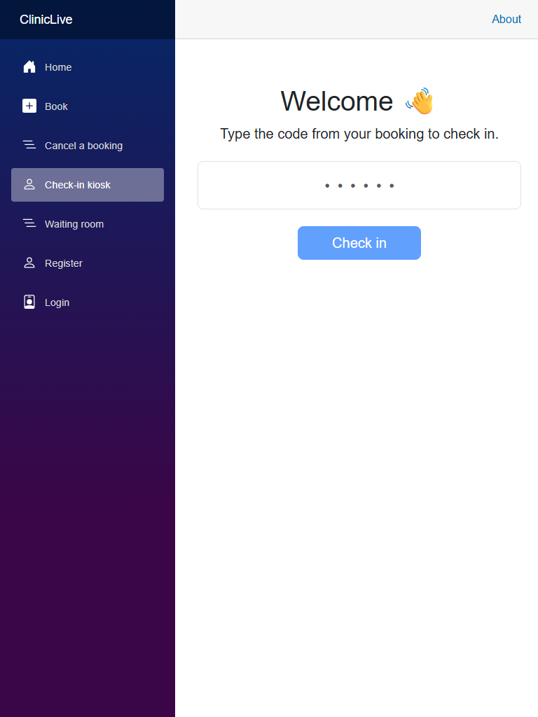 Before
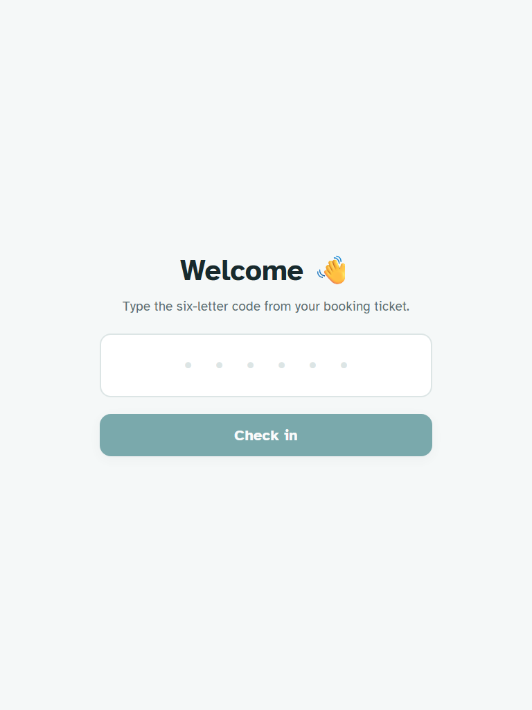 After
AfterThe success takeover — and the eight-second reset
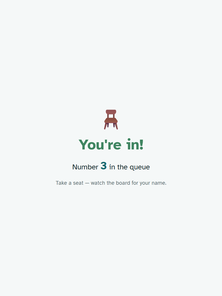
When the code lands, the kiosk doesn't show a status message. It takes over the entire screen: a celebration, the queue position enormous, and exactly one instruction —
<div class="kiosk kiosk-success" role="status">
    <div class="kiosk-emoji" aria-hidden="true">🪑</div>
    <h1>You're in!</h1>
    <p class="kiosk-position">Number <strong>@_result.Position</strong> in the queue</p>
    <p class="kiosk-hint">Take a seat — watch the board for your name.</p>
</div>
The answer to the patient's only real question — did it work, and what do I do now? — at a size that ends the interaction. And then, the insight of the part: a kiosk doesn't serve a user, it serves a queue of them. The next patient is already walking up, and they deserve a fresh screen — not the previous person's celebration. So the takeover resets itself after eight seconds:
if (_result.Success)
{
    _code = string.Empty;

    // A kiosk serves a queue of strangers: celebrate, then reset for the next person.
    _resetCts?.Cancel();
    _resetCts = new CancellationTokenSource();
    var token = _resetCts.Token;
    _ = Task.Run(async () =>
    {
        try
        {
            await Task.Delay(TimeSpan.FromSeconds(8), token);
            _result = null;
            await InvokeAsync(StateHasChanged);
        }
        catch (TaskCanceledException) { }
    }, token);
}
The line to interrogate in AI code like this: _ = Task.Run(...) — a
fire-and-forget delay on a page that can be disposed. Without the
CancellationTokenSource cancelled in Dispose(), a navigated-away kiosk
page would wake up eight seconds later and call StateHasChanged on a dead component.
A quick demo never shows that failure; that's exactly why background work in AI output is where
your review attention should go first. Here the cleanup is one line —
public void Dispose() => _resetCts?.Cancel(); — and it also covers the double-tap
case: a new success cancels the previous reset timer.
Errors that don't blame the patient
A kiosk error has a special cruelty: there's no support link, no F12, no one logged in — just a person standing in public in front of a machine that said no. So the words stay gentle (the friendly unknown/already-checked-in/cancelled messages were built into the service back in the production series), and every error carries the same human escape hatch:
<div class="alert alert-warning kiosk-oops" role="status">
    @_result.Error
    <br /><span class="text-muted small">Stuck? The front desk is right there —
    they'll sort you out.</span>
</div>
"The front desk is right there" is the sentence a web page could never write — it only makes sense because we know the physical room this screen lives in. Which is the whole thesis of these four parts, proven in one line of copy.
The meter: the kiosk pass added about forty cents of Sonnet — running Polish total ≈ $2.00. Two of the four surfaces redesigned, and we haven't reached the price of the coffee the front desk drinks while pointing at this kiosk.
Checkpoint: open /kiosk at tablet width. Type a seeded code lowercase
— it uppercases itself; the button stays disabled until six characters. Check in: the whole screen
becomes the celebration with your queue position huge. Count to eight — fresh screen, ready for the
next stranger. Type a wrong code: gentle words, and a pointer to the front desk instead of an error
tone.
The phone was personal, the kiosk is communal — and both are still screens people touch. The next surface is neither: a TV on a wall that nobody touches, ever, read from chairs five meters away by people who are bored, anxious, or both. It breaks the most rules of any part in this series, starting with the idea that it's a web page at all: Part 6: the board is not a web page.