Every surface so far had a user. The board doesn't — it has an audience. It hangs on a wall, nobody ever touches it, and it's read from chairs five meters away by people who are bored, anxious, or both. Ask this series' opening question — who uses this, in what physical situation? — and the answer dismantles almost every web-design habit you own. This is the deepest reframe of the redesign, and the part where our own design system learns when to step aside: the board is not a web page. It's signage.
- Prompt for signage: its own dark palette, every size in vmin, the name enormous, five up next, a clock, no live dot
- Give
.boarda fixed dark palette in hard-coded hex (#0E1B1E,#E9F2F1) instead of tokens - Size everything in vmin:
.board-nameat 13vmin, the list at 5vmin, labels at 2.2vmin - Cap up-next with
Take(5)plus a "+N more" line, and put@keyon the list items - Add a tabular mono clock ticked by a 20-second
System.Timers.Timer - Replace the live dot with a
.board-status"reconnecting" pill shown only when!_connected - Re-fetch
GetSnapshotAsync()inReconnectedafter re-joining the group - Compare with tag
polish-06in the repo
Follow along: git checkout polish-06 in
the companion repo — the commit message is
the prompt.
The prompt
Verbatim, from the commit "The board: signage, not a web page":
The board hangs on a wall and is read from chairs 5 meters away by
people who are bored, anxious, or both. Design it like signage: its
own permanent dark palette (a TV should not follow an OS theme), every
size in vmin so it scales with the physical screen, the serving name
enormous, up next capped at five with a '+N more'. Add a real clock —
waiting rooms run on it. And remove the little 'live' dot: plumbing
status is for staff; show something only when it's WRONG (a
reconnecting pill).Model pick: Opus, high effort — the one part of the four-surface tour that earns it. Parts 4 and 5 refined what their surfaces looked like; this part had to rethink what the surface is. "What IS this thing?" questions are exactly where the expensive model pays for itself, and the vmin idea below is what came back.
A TV doesn't have an OS theme
Part 2 made a rule and kept it everywhere: every color
is a token, and dark mode is a token redefinition under prefers-color-scheme. The board
deliberately breaks that rule — and the CSS explains itself:
/* ---------- the board (signage) ----------
   A TV on a wall is not a web page. Its own fixed dark palette — the room's
   lighting doesn't follow anyone's OS theme — sized to be read from chairs. */
.board {
    width: 100%; min-height: 100dvh;
    display: flex; flex-direction: column; align-items: center;
    background: #0E1B1E; color: #E9F2F1;
    padding: 3vmin 4vmin;
}
Hard-coded hex, no tokens. Why? prefers-color-scheme reports the OS setting of the little
PC plugged into the TV's HDMI port — a machine nobody looks at, expressing a preference nobody chose.
The board's palette is decided by the room: a dark screen with light text is calm on a wall,
doesn't glow like a shop sign at 8 a.m., and gives the called name maximum contrast. That's a
physical-world constraint, and physical constraints outrank system preferences. There's a design-system
lesson in this that's bigger than the board: a token system earns trust not by applying itself
everywhere, but by knowing where its writ ends. Rules that can't bend get quietly abandoned; rules with
explicit, documented exceptions get kept.
Think in vmin: design that scales with the screen
The second reframe is the part's centerpiece. A web page sizes text in rem — anchored to a
reading distance of half a meter. But the same board markup might run on a 32-inch TV in a small
practice or a 65-inch panel in a big one, and it's read from across a room. So every size on the board
is in vmin — a percentage of the screen's smaller dimension. The design stops being "16px
body text" and becomes "the serving name takes 13% of the screen" — a proportion, not a pixel
count. Buy a bigger TV and the design scales itself; the layout is tied to the physical object it hangs
on:
.board-name {
    font-size: 13vmin; font-weight: 700; line-height: 1.05;
    color: #63C7CC; margin: 0;
}
.board-list { font-size: 5vmin; font-weight: 700; line-height: 1.6; }
.board-label { font-size: 2.2vmin; text-transform: uppercase; letter-spacing: 0.14em; }
.board-clock { font-family: var(--mono); font-size: 2.6vmin; font-variant-numeric: tabular-nums; }
On a 55-inch TV, 13vmin makes the called name roughly nine centimeters tall — readable
from the far chairs, which is the only spec that matters. The hierarchy is exactly three steps: one
enormous name, five medium names, whisper-quiet labels. Nothing else earns space on the wall.
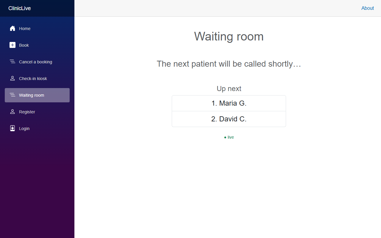 Before
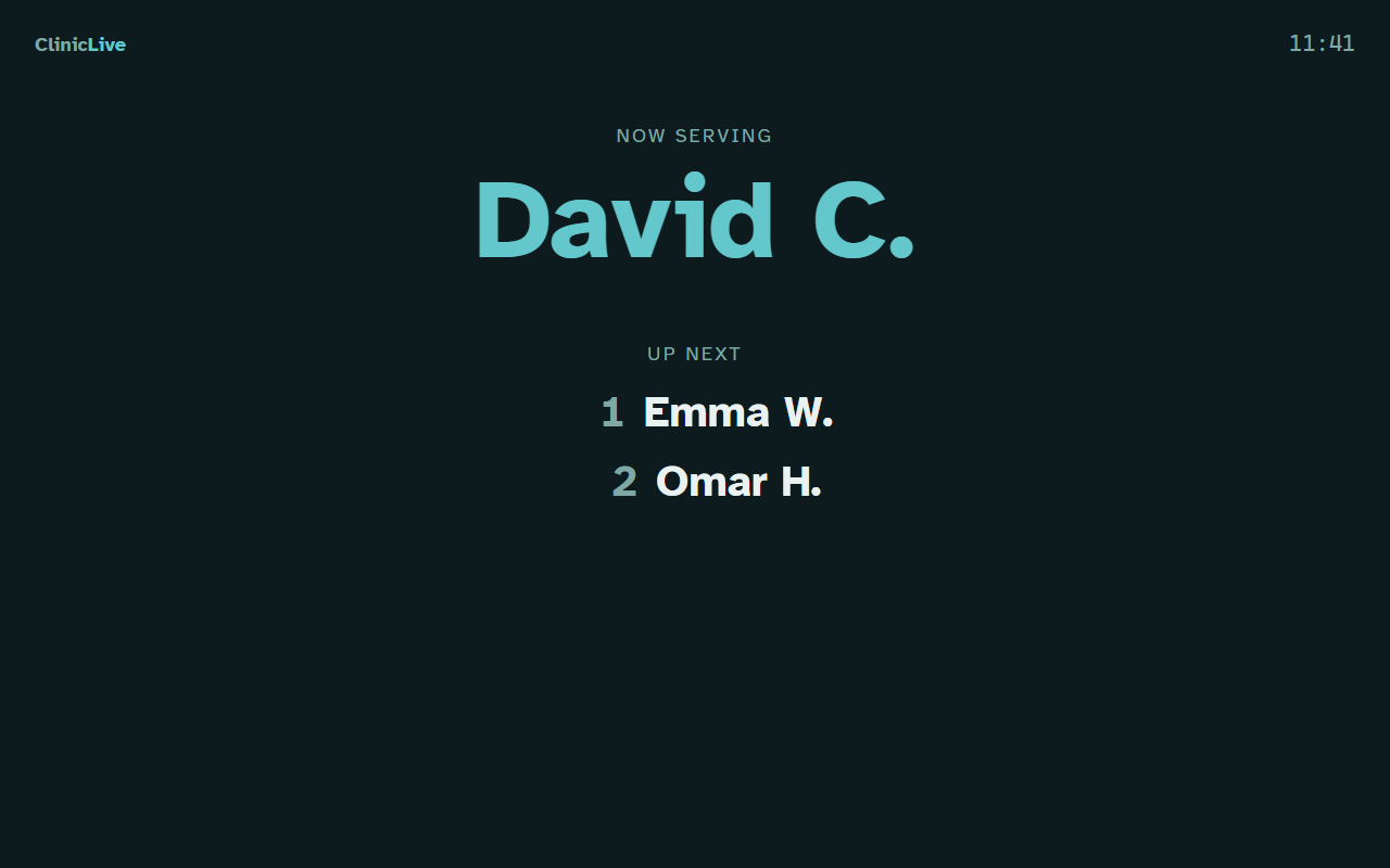 After
AfterFive names, then "+N more"
A queue of fourteen rendered in 2vmin type helps nobody — it just shrinks everyone's name to fit a list no one can read. The board caps up-next at five, because five is who needs to start listening; everyone deeper in the queue needs a number, not a nameplate:
<ol class="board-list">
    @foreach (var item in _snapshot.Waiting.Take(5))
    {
        <li @key="item.AppointmentId">@item.DisplayName</li>
    }
</ol>
@if (_snapshot.Waiting.Count > 5)
{
    <p class="board-empty">+ @(_snapshot.Waiting.Count - 5) more</p>
}
(Those @key attributes on the name and the list items are quiet scaffolding: when
Part 9 adds motion, Blazor will re-create keyed
elements as the queue changes, and CSS entry animations will hook exactly here.) The names themselves
are still first-name-plus-initial only — the privacy masking from
the production series that keeps a public wall from
becoming a patient roster.
A real clock
Waiting rooms run on the clock: I arrived at 9:40, it's 9:58 now, my slot was 9:45. Every person in those chairs is doing that arithmetic, so the board supplies the input — a live clock, top right, in tabular mono so it doesn't wobble as it ticks:
// a wall clock that actually ticks
_clock = new System.Timers.Timer(TimeSpan.FromSeconds(20));
_clock.Elapsed += (_, _) => _ = InvokeAsync(StateHasChanged);
_clock.Start();
A 20-second timer, not a one-second one — a wall clock needs to be right to the minute, and re-rendering a TV screen sixty times a minute to animate seconds nobody displays would be motion for motion's sake.
Status only when something is wrong
The production-series board had a little "● live" dot — and in Part 7 of that series it earned its keep, because we were building the real-time plumbing and needed to watch it work. But on signage it's backwards: a permanent green dot is the developer reassuring themselves, in public, forever. Patients don't need to know the board is connected; they need to know when it isn't. So the dot is gone, and status appears only in failure:
@if (!_connected)
{
    <div class="board-status">reconnecting…</div>
}
A small amber pill, bottom corner, that exists only while the truth requires it. Signage shows state, not plumbing. And reconnection got one more piece of honesty:
_hub.Reconnected += async _ =>
{
    await _hub.InvokeAsync(nameof(ClinicLive.Hubs.QueueHub.JoinBoard));
    _snapshot = await Queue.GetSnapshotAsync();
    _connected = true;
    await InvokeAsync(StateHasChanged);
};What the AI caught, this time: that snapshot re-query on
Reconnected wasn't in the prompt — the AI added it on review, with the reasoning
recorded in the commit: a board that was offline for a minute must catch up on the calls
it missed, not wait politely for the next broadcast. The production series taught re-joining the
group after reconnect (membership dies with the connection ID); the polish series adds re-fetching
the state. A wall display's contract isn't "receives events" — it's "is currently true."
The meter: the Opus part of the tour, and priced like it — about fifty cents for the reframe, the vmin system and the review conversation, bringing the Polish running total to ≈ $2.50. The most-seen screen in the whole clinic, redesigned for the price of the waiting room's parking meter.
Checkpoint: open /board full-screen on your biggest monitor and take
five steps back. The serving name reads easily; the up-next list shows at most five plus a
"+N more"; the clock is right. Check someone in at the kiosk — the name appears at 13vmin. Kill the
server: the amber "reconnecting…" pill appears. Restart it: the pill vanishes and the board shows
the current queue — including anything that changed while it was offline.
Signage optimizes for distance, calm, and one glance. Now walk the ten steps from the wall to the reception desk and watch every one of those rules flip: the person at that screen reads it all day, is paid to act on it, and wants more information per glance, not less. The final discipline of the four is the pro tool: Part 7: density with dignity.