Parts 1–3 built the machinery: a direction, a token system, and a screenshot loop. Now the machinery meets the surfaces. ClinicLive has four, and here's the framing that carries the next four parts: they aren't four pages — they're four different UX disciplines. A phone flow, a touch kiosk, wall signage, a pro tool. One question beats any style guide on all of them: who uses this, and in what physical situation? Today, the booking flow — and the answer is: one hand, a small screen, a stressed parent with a sick kid on the other arm.
- Prompt for one hand on a phone: grouped slots, a ticket as the product, a copy pass, phone keyboards
- Group slots into Morning and Afternoon with
SlotGroups(), four.slot-btnchips per row withtabular-nums - Make the confirmation a
.ticket: dashed border, day and time on top, a huge letter-spaced mono code, the next step below, a first-name greeting - Rewrite every state as a human sentence: loading, no slots,
[Required(ErrorMessage = ...)], and a submit button that says "Book 16:45" - Bring
/cancelup to the same standard: a big mono input and a "Cancel this appointment" button - Set
type="tel",type="email"andautocompleteon the form fields - Teach the harness a
--bookflag so it photographs the ticket - Compare with tag
polish-04in the repo
Follow along: git checkout polish-04 in
the companion repo — the commit message is
the prompt, as always.
One hand, one thumb, no patience
The booking flow was born in Part 6 of the production series, and functionally it's fine: pick a day, pick a slot, three fields, a confirmation code. But picture the person actually using it. They're not at a desk. They're in a kitchen holding a feverish four-year-old, phone in the free hand, thumb doing all the work. Every tap target that needs aiming, every message that sounds like a database, every keyboard that opens in the wrong mode — each one is a small tax on someone who's already having a bad morning. That picture, not a style guide, is the design brief.
The prompt
Verbatim, from the commit "Booking flow: grouped slots, the ticket, and a copy pass":
The booking page is where a stressed parent with a sick kid meets
us — design for one hand on a phone. Group the slots Morning/Afternoon
with quiet labels, big tap targets, tabular numbers. The confirmation
is the PRODUCT: make it a ticket — dashed border, the code huge and
letter-spaced in mono, the day/time above it, what-to-do-next below
it, and greet the person by first name. Then a copy pass over every
state: loading, no slots, errors — no system voice anywhere ('That's
not a valid slot time' becomes a human sentence). Phone keyboards:
type=tel, type=email, autocomplete.Model pick: Sonnet, medium effort. This is execution against a settled system — Part 1 made the taste decisions, Part 2 wrote the tokens, and today is applying both with care. Save the deep-thinking budget for Part 6, where a surface has to be re-imagined rather than refined.
A wall of 32 chips is not a choice
A clinic day is 09:00 to 17:00 in 15-minute slots — up to 32 buttons. Rendered as one undifferentiated grid, that's not a choice, it's a wall: every option shouts equally, so none of them register. But nobody thinks "I'd like 10:15." They think "sometime in the morning" — and only then pick a time. The redesign makes the page think the same way:
private IEnumerable<(string Label, List<DateTime> Slots)> SlotGroups()
{
    var morning = _slots.Where(s => int.Parse(Clinic.Local(s, "HH")) < 12).ToList();
    var afternoon = _slots.Except(morning).ToList();
    if (morning.Count > 0) yield return ("Morning", morning);
    if (afternoon.Count > 0) yield return ("Afternoon", afternoon);
}
Two groups under quiet uppercase micro-labels — the label whispers, the times do the talking. The chips
themselves get the phone treatment: four per row, so each one is wide enough to hit with a thumb without
aiming, and tabular-nums so every digit occupies the same width — 09:15 and
14:45 line up into a calm grid instead of a ragged one:
.slot-grid { display: grid; grid-template-columns: repeat(4, 1fr); gap: var(--s-2); }
.slot-btn {
font: inherit; font-weight: 700; font-variant-numeric: tabular-nums;
padding: 0.7rem 0; border-radius: var(--radius);
border: 1.5px solid var(--line); background: var(--surface); color: var(--ink);
}
.slot-btn.selected {
background: var(--primary); border-color: var(--primary); color: var(--on-primary);
}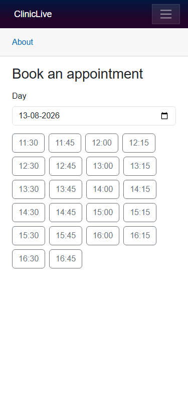 Before
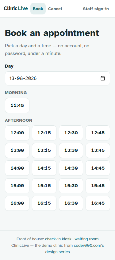 After
AfterThe ticket is the product
Here's the reframe at the heart of this part. The confirmation screen isn't the end of the flow — it's the thing the patient keeps. They'll screenshot it, show it at the kiosk, read the code aloud from it. It is, in a real sense, the product the booking page manufactures. The old version was a heading with a code in it. The new version is a ticket:
<p class="lead">You're booked, @FirstName(_confirmed.Patient.FullName). 🎉</p>

<div class="ticket">
    <div class="ticket-when">@Clinic.Local(_confirmed.StartsAt, "dddd d MMMM · HH:mm")</div>
    <div class="ticket-code">@_confirmed.ConfirmationCode</div>
    <p class="ticket-hint">
        Your check-in code. Type it at the kiosk when you arrive —
        it's also all you need to <a href="/cancel">cancel</a>.
    </p>
</div>
Greeted by first name, the day and time on top, the code huge in the middle, the next step underneath. The CSS says the quiet part out loud in its own comment:
/* the confirmation "ticket" — worth photographing, it IS the product */
.ticket {
    background: var(--surface); border: 2px dashed var(--primary);
    border-radius: var(--radius-lg); padding: var(--s-5);
    text-align: center; margin: var(--s-4) 0;
}
.ticket-code {
    font-family: var(--mono); font-size: 2.6rem; font-weight: 700;
    letter-spacing: 0.18em; color: var(--primary); margin: var(--s-2) 0;
}
The dashed border is doing the metaphor's work — it reads as a perforated stub, something torn off and handed to you. And the 2.6rem letter-spaced mono code isn't decoration: that code gets typed into a kiosk and read over the phone, so it's set like something meant to be transcribed.
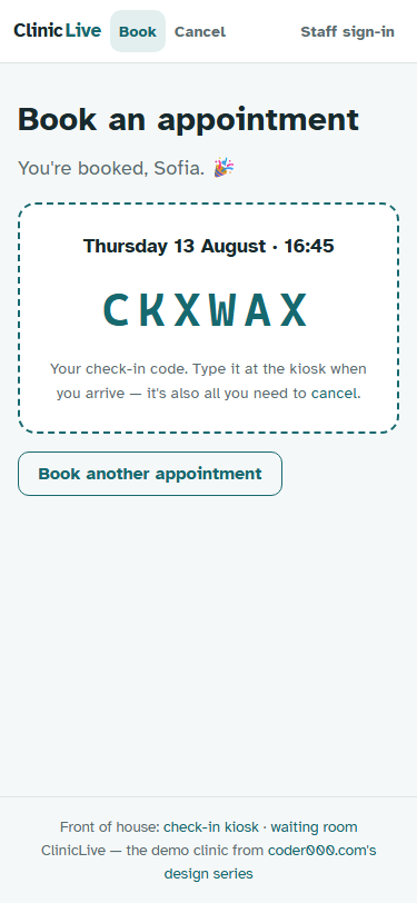
One meta-note: photographing this screen needed a real booking, so
Part 3's harness learned a --book flag — it
books the last free slot and photographs the ticket with the same one command as everything else. The
screenshot loop only works if it can reach every state worth designing.
The copy pass: firing the system voice
Then a pass over every state the page can be in, rewriting each message as a human sentence. Loading is "Checking the calendar…" — a person doing a thing, not a spinner. An empty day says "Nothing free on that day. Try the next one — mornings fill up first." — which doesn't just report the problem, it hands you the fix. Validation stops quoting field names:
[Required(ErrorMessage = "We need a name for the appointment.")]
[Required(ErrorMessage = "We need a phone number to find your booking later.")]
[EmailAddress(ErrorMessage = "That email doesn't look right — or leave it empty.")]
Notice each one explains why the field exists or what to do instead — a validation message is the app talking to someone it just interrupted, and it should sound like it knows that. Even the submit button joined the pass: it shows the choice it's about to commit — "Book 16:45" — and "Booking…" while it works. The cancel page got matched to the same standard: "Type the six-character code from your ticket. That's all we need." above a big mono uppercase input, and a button that says the honest words "Cancel this appointment" instead of "Submit".
The keyboard is part of the design
The cheapest UX win on the whole page is invisible in a desktop browser:
<InputText id="name" class="form-control" autocomplete="name" @bind-Value="_form.FullName" />
<InputText id="phone" class="form-control" type="tel" autocomplete="tel" @bind-Value="_form.Phone" />
<InputText id="email" class="form-control" type="email" autocomplete="email" @bind-Value="_form.Email" />
type="tel" opens the number pad; type="email" puts @ on the first
keyboard layer; autocomplete lets the phone offer to fill name, number and email in one
tap. For our one-handed parent, that can be the difference between typing three fields and typing zero.
The fastest form is the one the phone fills in itself.
Why the copy pass has to be an explicit step: left to defaults, the form speaks framework — DataAnnotations ships "The FullName field is required.", and the booking service's own guard said "That's not a valid slot time." (a real string from the production series that the prompt singles out by name). Neither an AI nor a tired human writes warm copy unprompted; the defaults are always the system voice. Budget the copy pass like a feature, because it is one.
The meter: Sonnet at medium effort is the affordable seat, and a full surface pass
— slot grid, ticket, copy, keyboards, plus the harness's new --book trick — brings the
Polish running total to ≈ $1.60. The screen patients will actually screenshot cost
less than what the clinic charges for a missed appointment's paperwork.
Checkpoint: open /book at 375px wide. Slots sit under Morning and
Afternoon labels in a four-column grid that doesn't jitter (tabular numerals). Pick a slot — the
submit button names it: "Book 16:45". On a real phone, the phone field opens the number pad and the
browser offers to autofill. Book, and the ticket appears: dashed border, huge code, your first name
in the greeting. Screenshot it — that's the point.
The booking flow assumed the most personal device there is: the patient's own phone, in their own hand, with their own autofill. The next surface assumes the opposite — a screen in a lobby that belongs to nobody, used standing up by strangers who have never seen it before and will use it for nine seconds. Same app, completely different discipline: Part 5: a kiosk for strangers.