Ten parts ago, ClinicLive worked but looked like the template it was born from. This series made the sequel promise: redesign it with AI and hide nothing — every direction debated, every design mistake kept, every dollar counted, and a screenshot of everything. The meter has stopped. Time to look at what we made.
The gallery
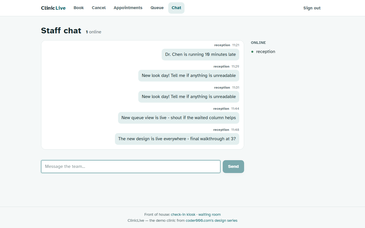
This is the payoff post, so the pictures go first. Every "before" is
part-12 — the app exactly as season one shipped it. Every "after" is the
tagged part where that surface got its treatment.
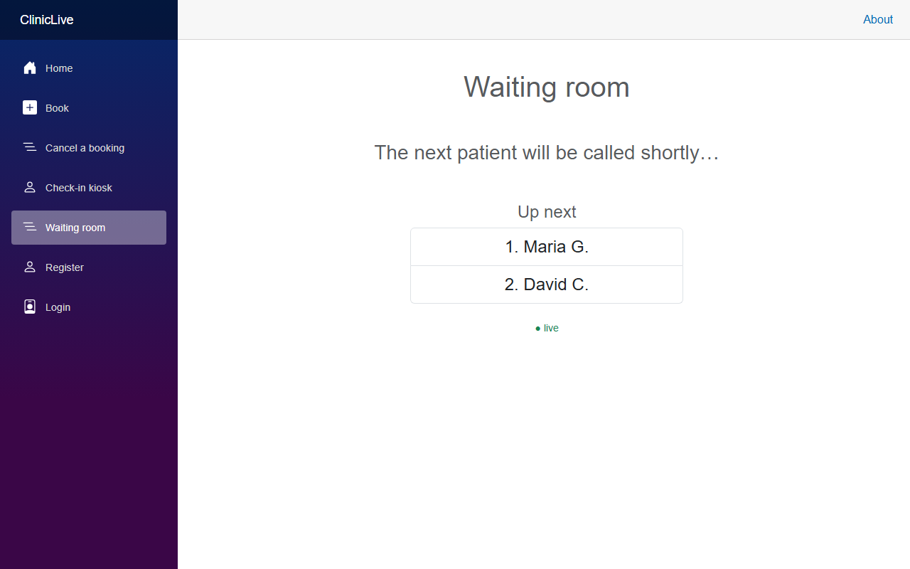 Before
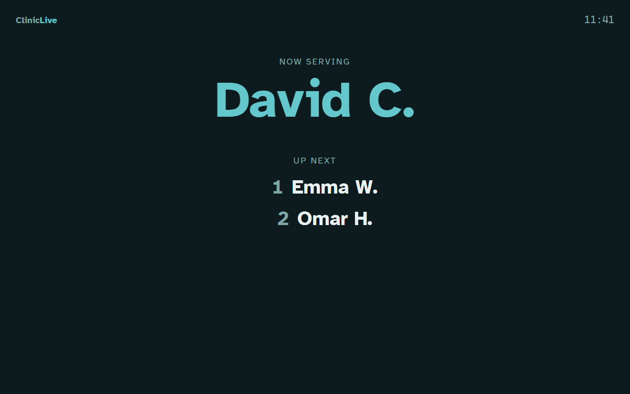 After
After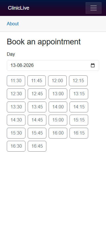 Before
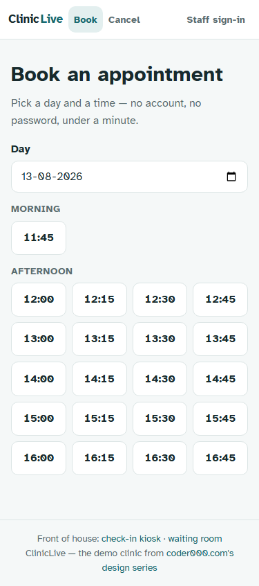 After
After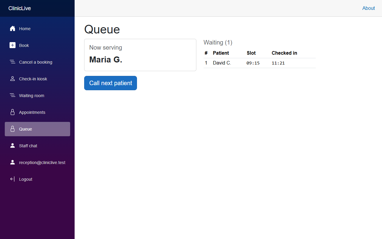 Before
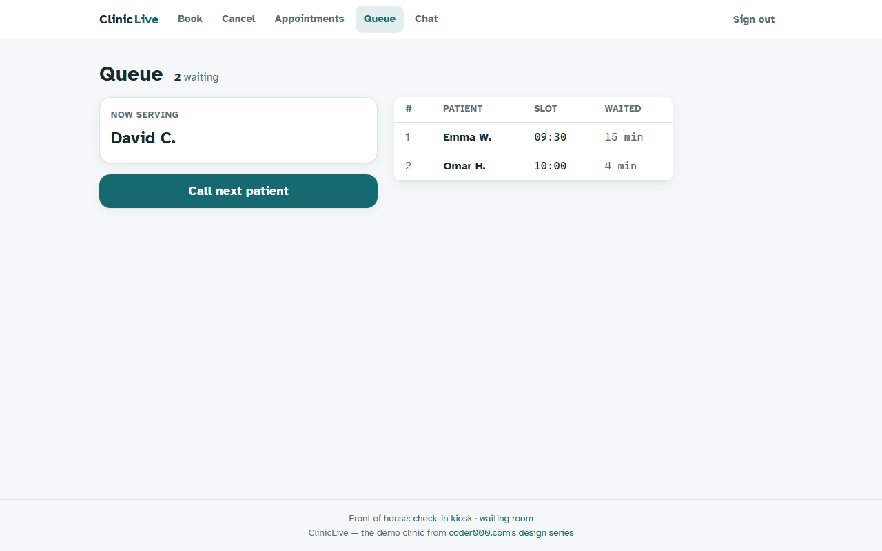 After
After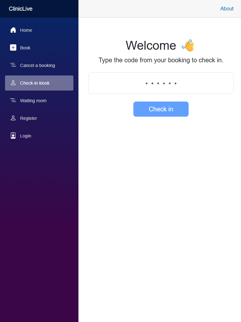 Before
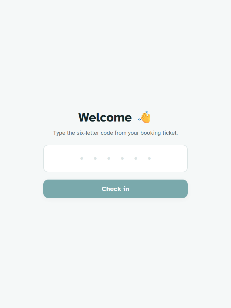 After
After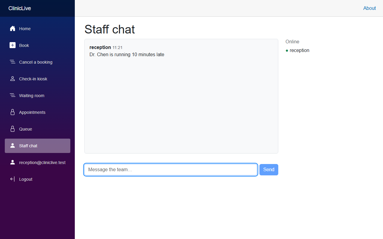 Before
 After
After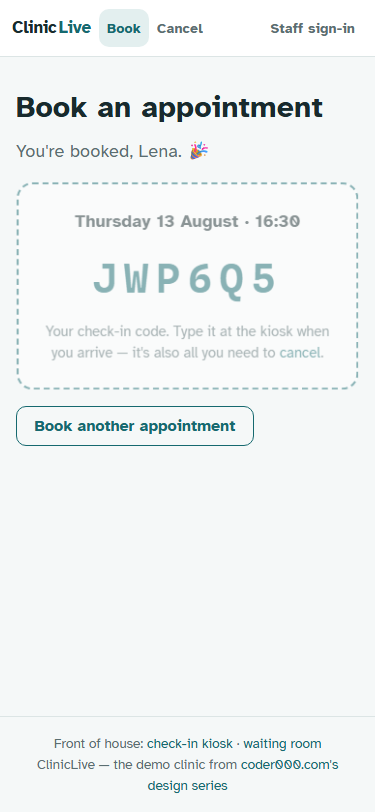
The bill, honestly
Same rules as season one's retro: cumulative API spend from the build log as each part landed. The log kept running totals at each milestone, so Parts 1 and 3 — the direction exercise and the screenshot harness — ride inside their neighbors' readings:
| Part | What we designed | Running total |
|---|---|---|
| 1–2 | Four directions and a choice; the porcelain-and-petrol tokens; Bootstrap deleted | ≈ $1.10 |
| 3–4 | The screenshot harness; the booking flow and the ticket | ≈ $1.60 |
| 5 | Kiosk: giant code entry, success takeover, auto-reset | ≈ $2.00 |
| 6 | Board: signage palette, vmin sizing, the clock | ≈ $2.50 |
| 7 | Staff: stat headers, the WAITED column, chat bubbles | ≈ $2.90 |
| 8 | Live regions, landmarks, skip link, the contrast audit | ≈ $3.20 |
| 9 | Motion that explains change; the nine-line interop file | ≈ $3.60 |
The meter, final reading: ≈ $3.60 for the entire redesign — a design system, four surfaces treated as four UX disciplines, an accessibility pass and a motion pass. Season one's $6.20 built ClinicLive working; $3.60 more made it something people would want to use. The redesign cost barely half the build — and it changed almost everything a user actually touches.
How the meter is measured, same as season one: it's the build's actual token consumption priced at the API list rates of the models used (the 🧠 boxes name them). If you work through a subscription plan instead of pay-per-token, your bill won't literally say "$3.60" — but the tokens burned are the same, so it's the honest apples-to-apples number.
And the same caveat as last time, because it's still true: the dollars are not the real cost. The real cost is the human eye — every screenshot reviewed, every direction judged, one palette vetoed outright. The meter buys drafts; the looking is where it became a design. Keep that in mind as you read the next table, because most of it is the looking.
The complete design-mistake log
Every 🤖 from ten parts, in one table:
| Part | What went wrong | Caught by |
|---|---|---|
| 1 — before shots | The waiting-room TV wore the app's sidebar — including a Register link that 404'd, because season one's hardening pass deleted the page and nobody deleted the link. Six parts of code review missed it. | The first screenshot |
| 1 — before shots | The demo data had aged out: seeded appointments were four days stale, and the kiosk correctly refused their codes. "Correct" and "demo-able" are different properties, and screenshots test the second one. | The screenshot loop |
| 1 — direction | The winning "Calm Practice" palette was a near-twin of the author's other project — same warm cream, same greens. The AI checks its output against the world's defaults, not against your own portfolio; it has no idea what else you've shipped. Version two became porcelain and petrol. | The human — nothing else could |
| 2 — foundations | Every h1 wore a teal focus ring — FocusOnNavigate
focuses the heading for screen readers, and the new global
:focus-visible rule happily styled it. Fix: rings on
interactive elements only. |
The screenshot loop |
| 2 — foundations | "An unhandled error has occurred" visible on every page. The deleted
template CSS had been quietly carrying
#blazor-error-ui { display:none } — the
invisible parts of a template are still load-bearing. |
The screenshot loop |
| 2 — foundations | The new top bar wrapped into three awkward rows at 375px — fine at every width the AI had "seen," broken at the one patients use. | The phone-width screenshot |
Read the right-hand column and season two's pattern appears, and it's different from season one's. There, the mistakes were about context — your rules, your timezone — and the catches came from reading code against a spec. Here, almost every catch came from looking at rendered output: the screenshot loop from Part 3 found things code review is structurally blind to, because no diff shows you a sidebar on a TV. And the one mistake the loop could never catch — the near-twin palette — needed a reviewer with something no model has: a memory of your own portfolio.
What the AI never caught alone
The mistake table undersells the human half, because the biggest contributions weren't corrections — they were direction. The AI proposed four art directions; a person chose Calm Practice and then vetoed its first palette. The WAITED column — the best feature of the staff redesign — arrived only after a human asked "what number does the person at the desk actually act on?" The kiosk's auto-reset came from "who uses this surface, and what state do they find it in?" In every case the AI executed beautifully once the question existed — and would have shipped something plausible and worse if it hadn't.
What the AI got wrong: the season in one sentence — it never had taste, it had defaults. Left unprompted it converges on the same purple-gradient slop Part 1 opened with; pointed at a surface with the right question, it produces work you'd pay a studio for. The AI executes judgment; it doesn't replace it. Your questions are the design.
What the AI was brilliant at
Fairness cuts both ways, and season two's wins were real:
- The vocabulary migration. Deleting Bootstrap while every page kept compiling — by inventorying the forty classes actually used and reimplementing them on the tokens — was the season's best engineering trick, executed flawlessly. A redesign that never breaks the build is a redesign you can ship incrementally.
- Per-surface reframing. Asked "who uses this, standing where?", it re-derived each surface from first principles: vmin sizing for a wall TV, a success takeover for people standing up, density for people paid to scan. The four-disciplines structure of this series came out of those answers.
- The copy pass. "Mornings fill up first." "That email doesn't look right — or leave it empty." "Stuck? The front desk is right there." Microcopy this humane usually requires a writer on staff; here it required asking.
- Tireless iteration. The screenshot loop ran dozens of look-adjust-reshoot rounds. A human designer's patience is a budget; the model's isn't. It never once defended a bad draft out of ego.
Model pick, the season's rule: Opus wherever the question was "what is this surface?" — the token system, the four directions, the board's signage reframing; Sonnet wherever execution ran against a settled system — booking, kiosk, staff pages, the motion pass. Same principle as season one, different axis: in design, the consequence of a cheap-model mistake isn't data loss, it's incoherence.
The tests postscript
One more number, and it might be the most persuasive one in the series: all nine
tests from season one stayed green through the entire redesign — every part,
polish-02 through polish-09, verified by the same CI. Ten parts
of touching every page, deleting a CSS framework, rewriting every layout — and the
harness built in season one silently
guaranteed that none of it changed what the app does. That's the compounding
return on testing nobody mentions: the suite you build in season one is what makes season
two safe to attempt. A redesign with no tests is a rewrite with better marketing.
Checkpoint, the last one: you've now shipped a designed app — not just working, but chosen: a token system with a portfolio-checked palette, four surfaces treated as four disciplines, announced to screen readers, explained through motion, and honestly accounted for. Here's what's next: run this season's loop on an app of yours. Before shots first — you can't see how far you've come without them.
Where next 🎉
Ten parts, one redesign, $3.60. The whole two-season arc — every prompt, every tag — lives
in the ClinicLive repo, and the
README's season-two tag table maps each polish-* tag to its part, so you can
check out any moment of the redesign and see it with your own eyes.
If you arrived here through the design door, the story starts one season earlier: From Prompt to Production, Part 1 builds the app this series just polished, spec to VPS, mistakes and all. The full catalog of everything on this site is on the series page.
And the story continues: ClinicLive works and it's polished — but it lives on a kiosk and a wall. Season three, From Prompt to Pocket, puts it in the patient's pocket: the same Blazor screens as a .NET MAUI app on Android and Windows and as a web app, with real push notifications, haptics, geolocation, a QR scanner and offline support — every native feature a capability interface, every screenshot from a real emulator and a real desktop, every dead end kept in.
One closing thought to carry off. Season one proved AI can build software with you; this season proved it can design it with you — but only steered. The slop everyone recognizes isn't what the models produce; it's what they produce unquestioned. Four directions instead of one default. A screenshot instead of a hope. "Who uses this, standing where?" instead of "make it pretty." The tools bring the polish — you bring the taste, and this series' real deliverable was the habit of insisting on it.
Thanks for seeing the redesign through, all ten parts of it. Now go make something of yours worth screenshotting. 🎨