Last stop on the four-surface tour, and the question — who uses this, in what physical situation? — flips every answer we've given so far. The phone user was stressed and new; the kiosk user was a standing stranger; the board's audience sat five meters away. Staff pages are used by the same two people, all day, every day, seated at arm's length, glancing over between a phone call and a patient at the desk. They don't need bigger text or gentler words — they need density, scannability, and numbers first. A pro tool follows the opposite rules from a public page, and knowing which rulebook you're holding is the discipline.
- Prompt that staff pages are pro tools: denser, faster to scan, numbers first
- Open every staff page with a
.staff-headheader of live stat chips: booked, in the building, done - Replace the "checked in at" column with WAITED minutes from
WaitedMinutes(item), red from 20 - Fade Done rows on the appointments list:
.row-done td { opacity: 0.5; } - Set patient names bold and phone numbers in muted mono
- Make chat bubbles:
.chat-msg.mineon the right in primary-soft, others left, green presence dots in the online list - Check as reception with two check-ins seeded, then open
/staff/chatin two browsers as two users - Compare with tag
polish-07in the repo
Follow along: git checkout polish-07 in
the companion repo — the commit message is
the prompt.
The prompt
Verbatim, from the commit "Staff surfaces: density with dignity":
Staff pages are pro tools — the opposite rules from the public pages:
denser, faster to scan, numbers first. Give every staff page a header
with live counts. On the queue, replace the 'checked in at' column
with WAITED-minutes and turn it red past 20 — that's the number
reception manages by. Fade completed rows on the appointments list.
Make chat read like a chat: bubbles, mine on the right, online list
with presence dots.Model pick: Sonnet — the mirror image of Part 6's Opus call. Once "these are pro tools" is named in the prompt, everything downstream is execution against the token system. The thinking in this part lives in the prompt itself, and it cost whatever a minute of watching a reception desk costs.
Numbers before furniture
Every staff page now opens with the same pattern: a heading and a row of live stat chips. Reception's day is a set of counts — how many booked, how many in the building, how many done — so the header answers before the table is even scanned:
<header class="staff-head">
    <h1>Today</h1>
    <p class="staff-stats">
        <span class="stat"><strong>@_appointments.Count</strong> booked</span>
        <span class="stat"><strong>@_appointments.Count(a => a.Status is AppointmentStatus.CheckedIn
            or AppointmentStatus.InProgress)</strong> in the building</span>
        <span class="stat"><strong>@_appointments.Count(a => a.Status == AppointmentStatus.Done)</strong> done</span>
    </p>
</header>
"12 booked · 3 in the building · 2 done" — that one line is most of what a practice manager walks over to ask. The queue page's header says how many are waiting; the chat's says who's online. Same shape everywhere, so the eye learns where the numbers live.
The WAITED column
Here is the design question of the whole part: what number does the person at the desk actually act on? The old queue table showed "checked in at 10:42" — a fact, but one that forces reception to do mental arithmetic against the wall clock, for every row, all day. Nobody acts on a check-in timestamp. They act on how long someone has been sitting there — because that's the apology threshold, the "let me find out what's happening" trigger. So the column becomes the answer instead of the input:
<td class="font-monospace @(WaitedMinutes(item) >= 20 ? "text-danger" : "text-muted")">
    @WaitedMinutes(item) min
</td>

private static int WaitedMinutes(QueueItem item) =>
    Math.Max(0, (int)(DateTime.UtcNow - item.CheckedInAt).TotalMinutes);
Quiet muted mono while things are fine — and red at 20 minutes, which turns the table into a triage
view: a glance shows whether anyone has crossed the line, without reading a single row. This is what
"numbers first" means in practice: not more numbers, but the number, pre-computed, with its
threshold built in. (Sharp-eyed readers of the production series will spot QueueSvc in
this page's code — the rename that fixed
Part 7's CS0542 is still standing, a small scar the
redesign never needed to touch.)
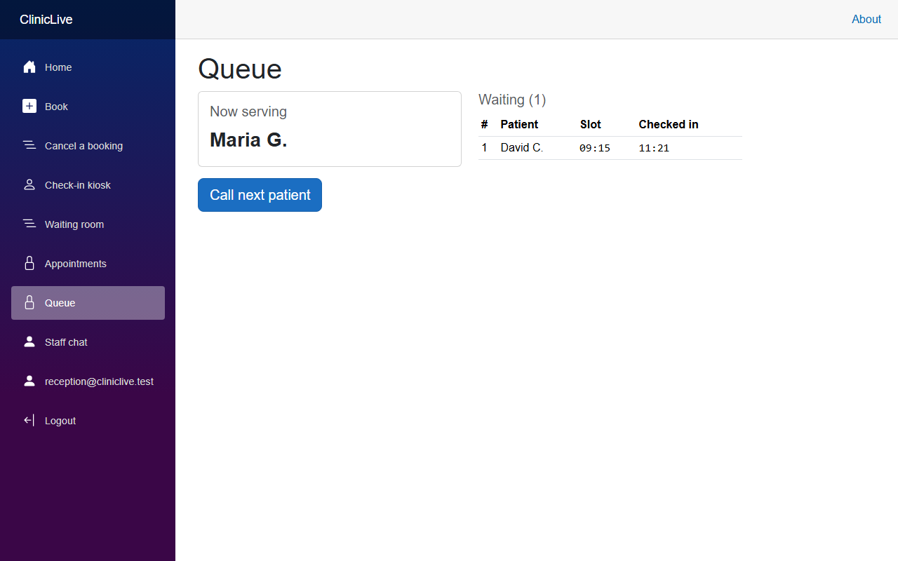 Before
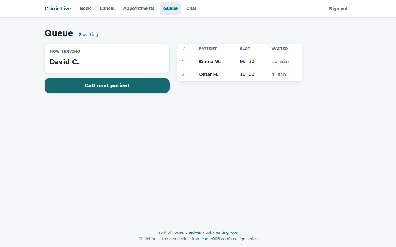 After
AfterLet finished work fade
On the appointments list, rows whose status is Done drop to half opacity:
<tr class="@(a.Status == AppointmentStatus.Done ? "row-done" : "")">

.row-done td { opacity: 0.5; }
One declaration, and the table now has a visual reading order that matches the job: the day's history dims, the work still ahead stands out. The columns got the same treatment — patient names bold, phone numbers muted mono — because reception scans for who, then acts on how to reach them. Density isn't cramming; it's making sure the brightest thing on screen is the next thing to do.
A chat that looks like a chat
The staff chat's mechanics — presence, typing indicators, the circuit lesson — were built in Part 8 of the production series. Visually, though, it was a list of stacked text lines. Every chat app on earth has trained the same reading grammar: bubbles, mine on the right, theirs on the left. Matching that grammar isn't imitation — it's letting twenty years of muscle memory do your UI teaching for you:
<div class="chat-msg @(m.SenderName == _me ? "mine" : "")" @key="m">
    <span class="chat-meta">
        <strong>@ShortName(m.SenderName)</strong>
        <time>@m.SentAt.ToString("HH:mm")</time>
    </span>
    <span class="chat-bubble">@m.Body</span>
</div>
.chat-msg { max-width: 85%; }
.chat-msg.mine { align-self: flex-end; text-align: right; }
.chat-bubble {
display: inline-block; text-align: left;
background: var(--surface-2); border-radius: var(--radius);
padding: var(--s-2) var(--s-3);
}
.chat-msg.mine .chat-bubble { background: var(--primary-soft); }My bubbles sit right in primary-soft petrol, others left on a plain surface; the sender-and-time meta line shrinks to a whisper. The online list gets green presence dots, and on a phone the side column stacks below the conversation — reception does check the chat from the corridor.
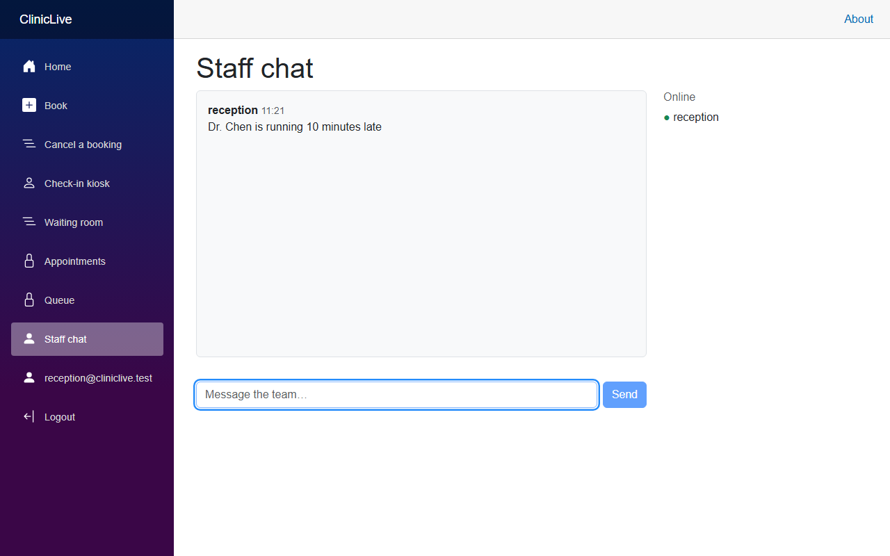 Before
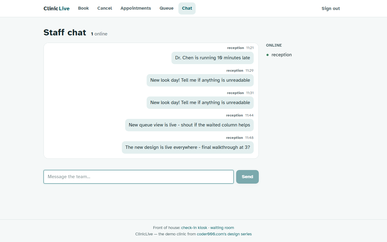 After
AfterWorth being honest about whose idea the good part was: the WAITED column came from the prompt, not the model. Given "denser, numbers first," the AI executes beautifully — stat chips, the elevated table, the bubble CSS all landed on the token system first try. But which number the desk acts on is domain knowledge, and it came from watching a reception desk work. No model can watch your users for you; the prompts in this series are where that watching gets written down.
The meter: the staff pass added about forty cents of Sonnet — running Polish total ≈ $2.90. That's the full four-discipline tour — phone, kiosk, signage, pro tool — polished for well under a dollar a surface.
Checkpoint: log in as reception and open /staff/queue with two
check-ins seeded. The header's waiting count matches the table; the WAITED column shows minutes in
mono and turns red at 20. On /staff/appointments, done rows sit at half opacity while
names stay bold. Open /staff/chat in two browsers as two users: your messages bubble
right in petrol, theirs left, and both names carry green dots in the online list.
Four surfaces, four disciplines, one question asked four times — and every answer came from the physical room, not from a style guide. But there's a dimension of these screens we haven't audited at all: how they read when you can't see them. A live board that updates silently is invisible to a screen reader; a kiosk result that only changes pixels never happened for someone listening. The redesign isn't done until it announces itself: Part 8: the accessibility pass — announce, don't just paint.