Season one of this story, From Prompt to Production, ended with a retrospective and a working app: ClinicLive books appointments, checks patients in at a kiosk, and calls them from a live waiting-room board — tested, hardened, deployed. It also looks exactly like the template it was born from. This series is the design sequel: same repo, same AI pair, ten parts to close the gap between "works" and "looks like someone meant it."
- The season-one app:
git checkout part-12ingithub.com/rahulvyas777/clinic-live, the permanent before photo - A quick Playwright script that captures every surface at its natural size: 375px phone, tablet, 1280 desktop
- Demo appointments that are still in the future (the kiosk shot needed a re-seed after they aged out)
- The palettes and typefaces of your own other projects, to paste into the directions prompt
- Claude Code on Opus, high effort, for the four-directions prompt
First, the before photos
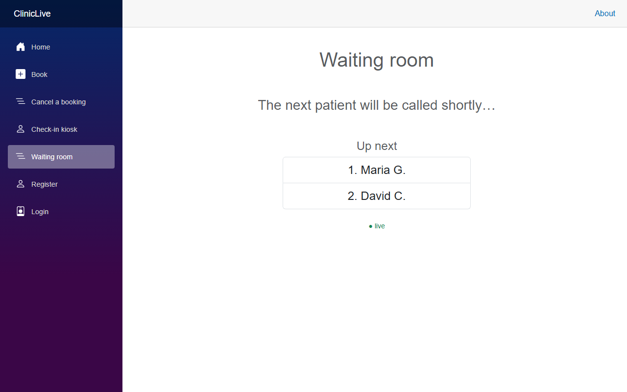
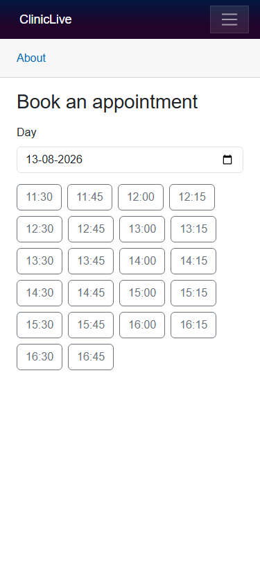
Before touching a line of CSS, we photographed everything. Partly for honesty — a redesign series that can't show its "before" is just a mood board — and partly because those photos turn out to be a working tool, not a keepsake. A quick Playwright script (it graduates into a proper harness in Part 3) captured all ten surfaces at their natural sizes: the booking page on a 375px phone, the kiosk on a tablet, the board and the staff pages at 1280.
Here is the waiting-room board — the screen that hangs on a wall and gets read from chairs:
And the booking page, the screen a stressed parent meets on a phone:
Two bugs before a single design decision
The before shoot was supposed to produce evidence. It produced findings. Look at that board screenshot again: the sidebar offers Register — and Register has been a 404 since Part 11's hostile review deleted the whole self-registration surface. Nobody removed the sidebar link. Which means the TV on the waiting-room wall spent the rest of season one offering patients a link to an error page, and it survived a test suite, a hostile security pass, and a deploy checklist — because all of those read code, and in code nothing is wrong. A link to a deleted page is perfectly valid markup. It's only wrong on a television. One photo caught it.
The second finding came from the kiosk:
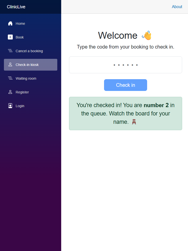
The kiosk was being perfectly correct: those codes really did belong to appointments in the past, and refusing them is exactly what Part 11 would have demanded. But "correct" and "demo-able" are different claims, and demo data has a shelf life. Both bugs go in the log, both get fixed in the next two parts — and notice what found them: not a review prompt, not a test, a camera. Hold that thought until Part 3.
Why AI design converges on slop
Now the actual subject. Ask an AI to "make it look nice, modern and professional" and you will get the same app everyone else got: a purple gradient somewhere load-bearing, Inter on white, three feature cards with icons, generous rounded corners, a hero section congratulating you on visiting. This isn't a personality flaw — it's what a language model is. It predicts the likely continuation, and a generic prompt asks for the most likely design. A vague "make it nice" is, quite literally, a request for the average of the internet.
The trap has a second jaw. When the average design comes back, most of us can't articulate why it's wrong — "it looks AI-generated" isn't actionable feedback — so we ask for another pass, get a slightly different average, and settle. You can't art-direct what you can't name. The fix is to change the shape of the request so that naming happens up front.
The technique: propose wide, choose narrow
Instead of asking for a design, ask for directions — several of them, genuinely different, each pinned down hard enough to be judged. The ask is small; the constraints are the whole trick:
"Propose four visual directions for this app, and make them genuinely
different from each other. For each: a name, background / ink / accent
colors as hex, one typeface, and a single line on how it should feel.
No purple gradients, no default-font-on-white. Directions only — no
CSS yet."
Hex codes force commitment — "warm and inviting" is not falsifiable, #FAF7F2
is. One line of feel keeps each direction honest about what it's for. And "no CSS yet" is
the same clause that made season one's security review work: proposals first, so the human
stays the judge. Here are the four that came back, exactly as proposed:
| Direction | Palette & type | Feels like | |
|---|---|---|---|
| A | Calm Practice | Warm paper #FAF7F2, ink #1F2A2E, sage #5B8A72, clay #C4664B for warnings · Atkinson Hyperlegible | A practice you trust |
| B | Swiss Health | Pure white, near-black, a single red #D32F2F accent, hard grid · Helvetica stack | Precision, zero warmth |
| C | Night Shift | Dark-first slate #16181D, cyan #4DD0E1, glowing board | Mission control |
| D | Friendly Paper | Cream, rounded everything, Fraunces serif accents | A children's clinic |
Four real options, and now choosing is a human-sized job. B is a beautiful poster and a cold clinic. C is right for exactly one of our surfaces — remember it when the board gets its own dark treatment in Part 6 — and wrong for a family clinic's public pages. D risks twee the moment it meets staff-page density. A is clinic-appropriate warmth, works in light and dark, and its typeface is a story in itself. We picked A.
Model pick: Opus, high effort, for the directions. Divergence is a thinking task — asked for four directions, the cheap model tends to return one direction wearing four names. Everything else in this part (the before shoot, the revision below) is pennies on any model.
The human veto
This is where the part earns its title. Tokens were about to be built on Calm Practice when
a nagging feeling produced the most valuable prompt of the season so far, verbatim:
"it's not similar to my other project, right???" — three question marks, because
the feeling was already pretty sure. We opened the stylesheets of my other project,
UnifiedSelf, and checked: cream #F4F1E8, green #2C7A4B, sage
#A8BDB6, Fraunces. Direction A — warm paper, sage primary, serif-adjacent
warmth — was its near-twin. The "distinctive" direction was distinctive against the
internet and derivative against my own portfolio.
What the AI got wrong: nothing it could have known — which is exactly the lesson. The model optimized "distinct from AI defaults" because that's what the prompt asked for and that's the corpus it can see. Your portfolio is the corpus it can't. "Distinctive" has two halves — distinct from the slop and distinct from your own prior work — and the second half is your job to bring: paste your other projects' palettes into the prompt, or expect a twin. The veto itself also doesn't delegate: the AI rated Calm Practice distinctive right up until it was shown otherwise.
v2: porcelain & petrol
The revision kept everything that was right about A — calm, light, accessible — and moved
the hue away from my own shadow: cool instead of warm. "Calm Practice: porcelain
& petrol" — porcelain #F5F8F8 background, white surfaces, ink
#182A2D, petrol teal #16696F as the primary, coral
#C96F4A as the accent, #3E8460 for good news and
#B4473C for bad. The dark set was priced on day one rather than bolted on
later: #101B1D background, #182527 surfaces, ink
#E4EDEC, primary lifted to #4FB3B8.
The typeface survived both versions, and deserves its sentence: Atkinson Hyperlegible was designed by the Braille Institute for low-vision readers — its letterforms are deliberately unambiguous, so 1, l and I, or 0 and O, can't impersonate each other. A clinic's UI is read by anxious people, older people, and people squinting at a wall from five meters. That's an accessibility story built into a font choice, and Part 8 will hold the rest of the design to the same standard.
The plan for the season
Two strategy decisions are already made, and both come from treating the redesign like the engineering project it is. First, foundations before beauty: Part 2 builds a token system and — the migration trick of the season — deletes Bootstrap while keeping its class vocabulary, so every page keeps compiling. The kiosk and the board become chrome-free "appliances," which is also the structural fix for that Register link. Second, after Part 3 makes the screenshot loop a real tool, each surface gets its own part as its own UX discipline: phone, touch, signage, pro tool. Four surfaces, four different sets of rules — that's the argument of the whole series.
The meter: season one closed at ≈ $6.20 total; season two's meter starts fresh. ≈ $0.40 so far — the before shoot, four directions, and the porcelain & petrol revision. The most valuable contribution of the part — "it's not similar to my other project, right???" — was typed by a human, free of charge.
Checkpoint: git checkout part-12 in
the repo is forever the
before photo: the board wears its sidebar, the sidebar offers Register, and Register
404s. The before screenshots are committed under shots/before — the next
nine parts argue against that folder.
Next, the foundation every later part will spend: every color a custom property, dark mode by redefining tokens instead of touching components, and Bootstrap deleted on the same day every page keeps compiling — Part 2: Foundations: design tokens, dark mode — and killing Bootstrap.