Previously, in Part 9, the app learned to remember a visit and to survive a dead signal. The phone is done. This part is about the host that has been quietly compiling since Part 2 without ever being designed: Windows. The fix is smaller than you'd guess — a window size, one CSS breakpoint, one new page — and the interesting part is what it deliberately isn't.
- Prompt for a desktop feel without desktop-specific screens
- In
App.CreateWindow, forDeviceIdiom.Desktoponly, open at 1100x760 with a 420x640 minimum - Add one
@media (min-width: 900px)block topocket.cssthat turns the tab bar into a side rail on the same DOM - Inside it, widen the content column to 44rem and give the offline strip its own grid row
- Add a Waiting-room page that re-reads
/api/pocket/queueonLive.Changed, masked names only, as a fifth tab on every host - Prove it: drag the Windows window below 900px, and widen the browser host past it
- Open Waiting room on any host and call next from the staff page
- Compare with tag
pocket-10in the repo
The prompt: no desktop-specific screens
Verbatim from the commit in the
repo (tag pocket-10):
"Make the Windows build feel like a desktop app without writing
desktop-specific screens. Open at a reception-desk size with a sensible
minimum (desktop only — phones ignore it). Turn the bottom tab bar into a
side rail past 900px with ONE CSS breakpoint on the same DOM, so the browser
host gets the desk layout on a laptop for free and the Windows window flips
between layouts as it's resized. Add a Waiting-room page — the public board,
now serving and up next with masked names, on the live hub — as a fifth tab
everywhere. Prove it by shrinking the window to phone width."
The constraint is the whole prompt: without writing desktop-specific screens. The
temptation with a MAUI app is to check DeviceInfo.Idiom in a layout and branch
— and then you have two layouts to keep honest, and the browser host, which has no idiom,
gets neither. So the desk layout had to be a property of width, not of host.
Model pick: Sonnet, medium effort. This part is CSS and a window size; the only judgment call was "one breakpoint, no host-specific layout code", and that was made in the prompt. The cheaper model executes a settled decision perfectly well — the season's rule since the design retro.
A window with opinions
The whole of the native change is in App.CreateWindow, and it is guarded by
idiom rather than platform, because a tablet is not a desk either:
// Desktop only (ignored on phones): open at a reception-desk size, never
// shrink below a phone's worth of width. Part 2's first Windows screenshot was
// a phone layout stretched across a 4K monitor — this is the fix.
if (DeviceInfo.Idiom == DeviceIdiom.Desktop)
{
window.Width = 1100;
window.Height = 760;
window.MinimumWidth = 420;
window.MinimumHeight = 640;
}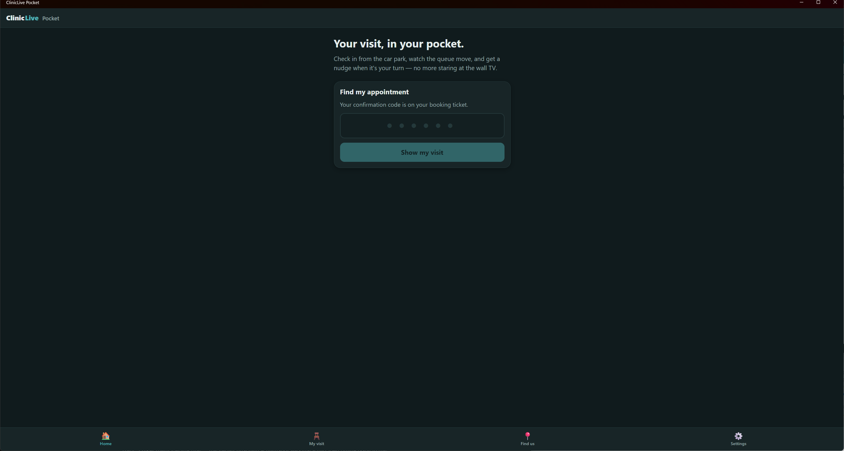 Before
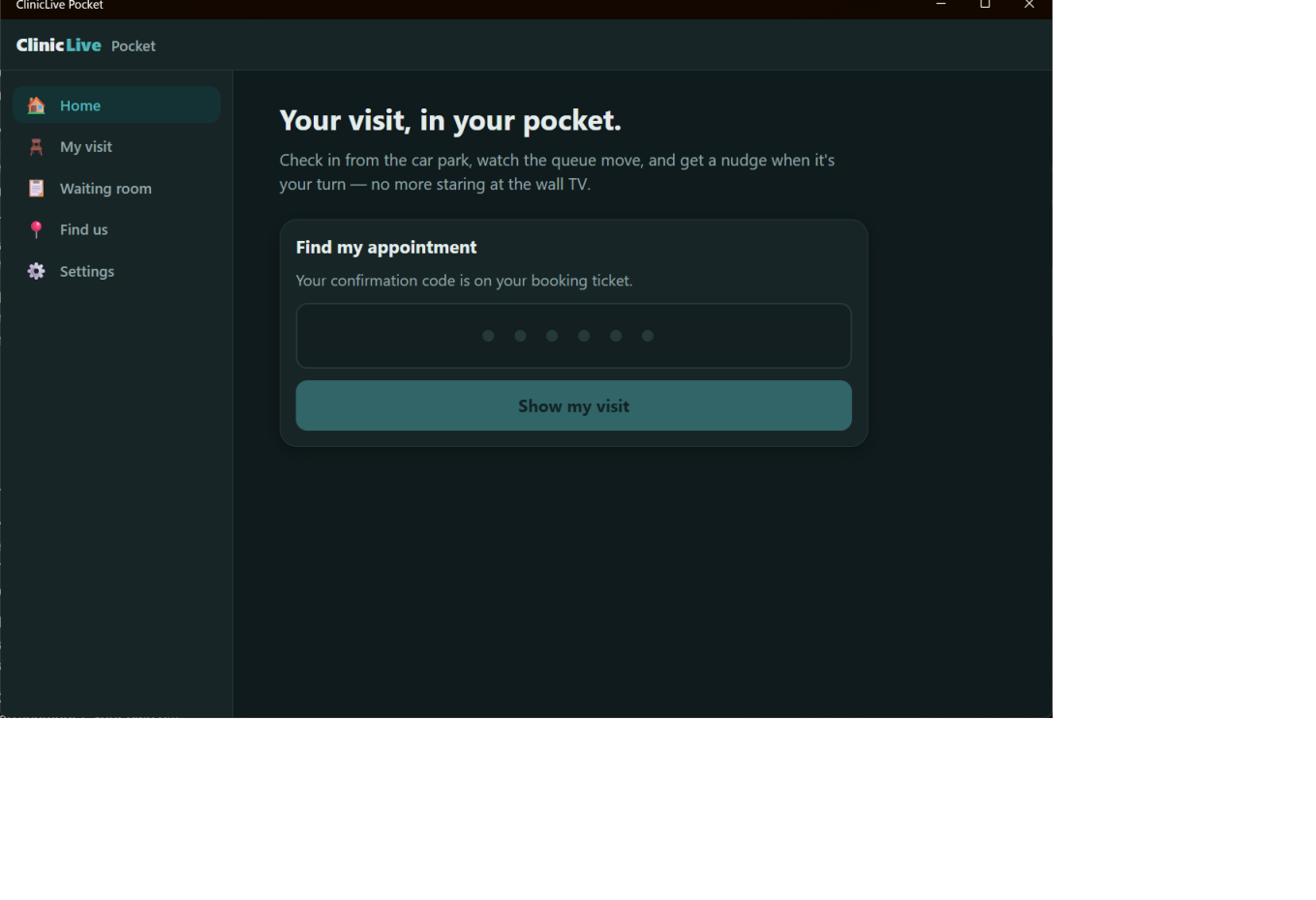 After
AfterOne breakpoint, not one layout per host
The layout component didn't change shape at all. Its nav still says what it said in
Part 2 — @* Bottom tab bar on a phone; a side rail on anything wide (pure CSS, see
pocket.css). *@ — and the whole desk treatment is one media query in the shared
stylesheet:
/* ---------- wide screens: the desk layout (Part 10) ----------
   Same DOM, same components. Past 900px the tab bar becomes a side rail and
   the content column stops pretending to be a phone. The browser host gets
   this for free on a laptop; the Windows app gets it whenever the window is
   wide enough — and drops back to the phone layout when it isn't. */
@media (min-width: 900px) {
    .app {
        display: grid;
        grid-template-columns: 15rem minmax(0, 1fr);
        grid-template-areas:
            "top    top"
            "banner banner"
            "nav    main";
    }
    .app-main { grid-area: main; max-width: 44rem; margin: 0; }
    .tabbar {
        grid-area: nav;
        position: static; height: auto;
        flex-direction: column; justify-content: flex-start;
        border-top: 0; border-right: 1px solid var(--line);
    }
    .tab { flex-direction: row; justify-content: flex-start; border-radius: var(--radius); }
    .tab.active { background: var(--primary-soft); }
    /* … */
}
The tab bar stops being position: fixed and becomes a grid column; each tab
turns from a stacked icon-over-label into a row with a rounded active state; the content
column grows from 32rem to 44rem. Part 9's offline strip gets its own grid row so it still
spans the window. Nothing in C# knows this happened. Which is exactly why the proof the
prompt asked for works in both directions:
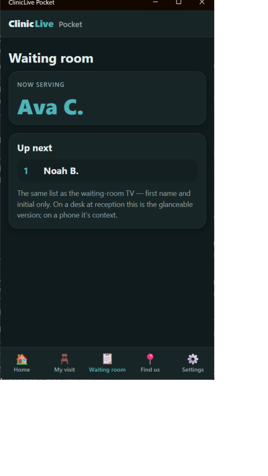 Windows at its 420px minimum
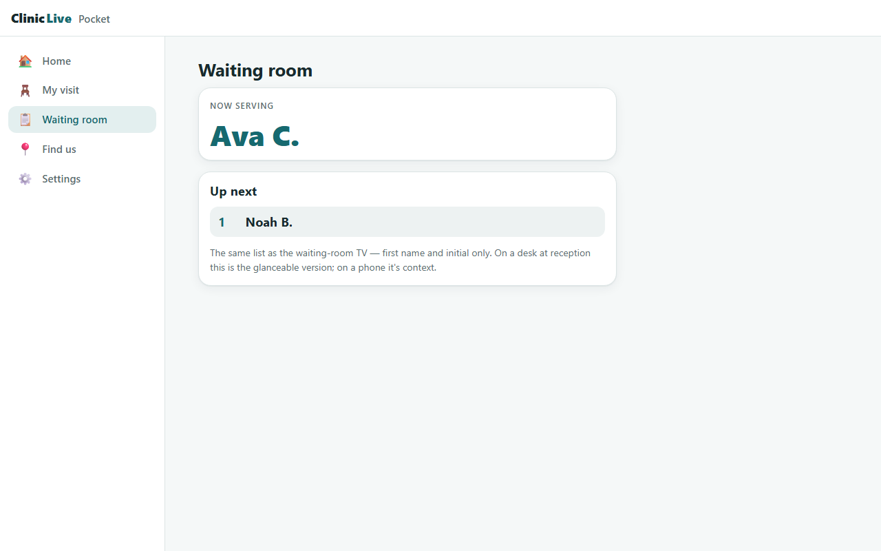 Browser, 1280px
--dark flag.)
The waiting-room page
A desk needs something to glance at, and the app already knew how to be a wall TV — the
phone joined the same QueueHub as the board back in
Part 4. So the fifth page is the public
board, re-rendered as a card: now serving, then the numbered up-next list, first name and
initial only, exactly as season two's
signage shows it. The whole page is forty lines because the live plumbing already
existed:
protected override async Task OnInitializedAsync()
{
    Live.Changed += OnQueueChanged;
    Live.ConnectionChanged += OnConnectionChanged;
    await Live.EnsureStartedAsync();
    _connected = Live.IsConnected;
    await LoadAsync();
}

private void OnQueueChanged() => _ = InvokeAsync(async () =>
{
    await LoadAsync();
    StateHasChanged();
});
Notify, don't ship state — the queue arrives by re-reading /api/pocket/queue
when the hub says something changed, the same single signal the TV listens for. It's a
fifth tab on every host, because phones allow five, and the copy under the list explains
why it exists in two places: on a desk it's the glanceable version; on a phone it's context.
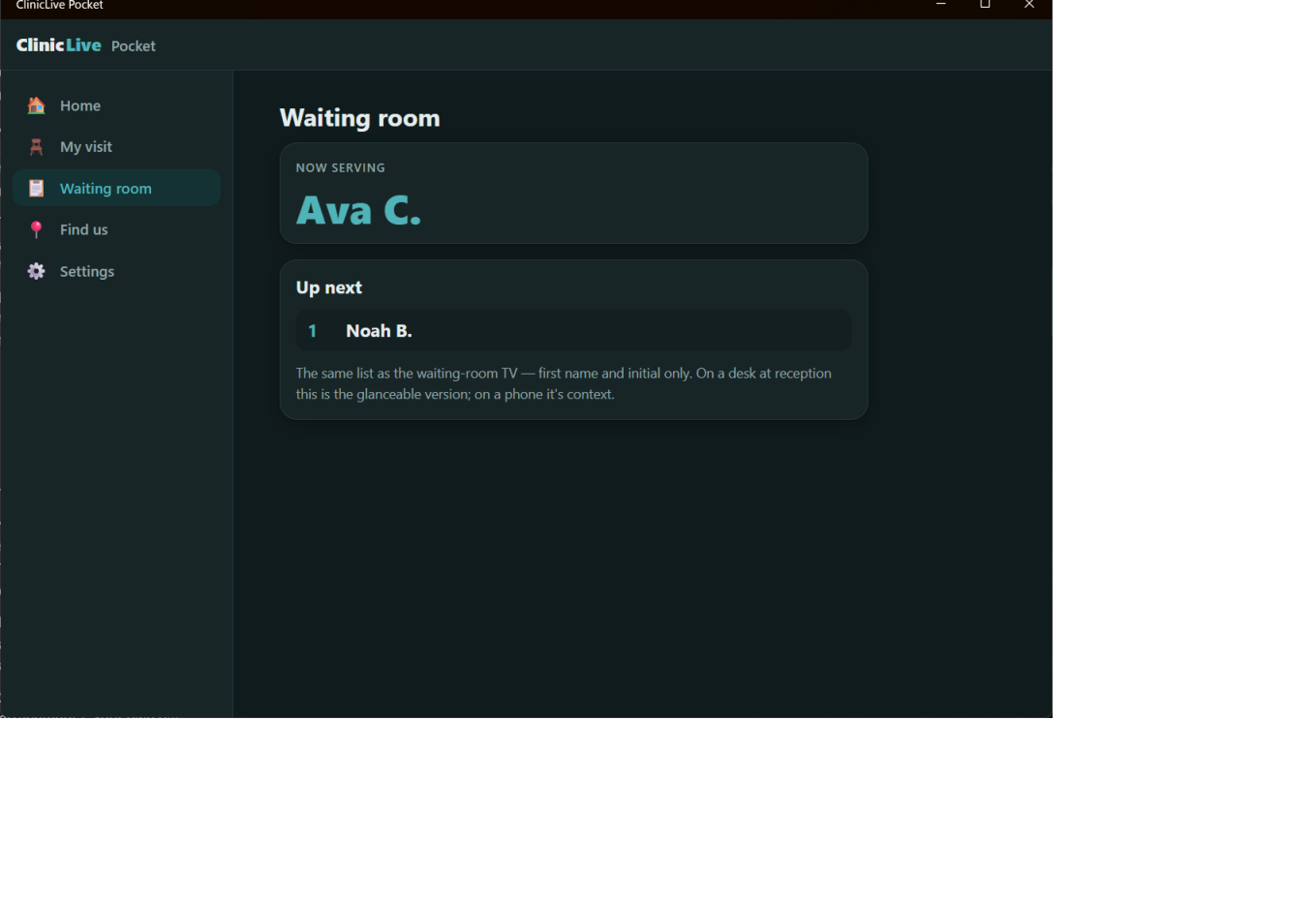 Desk
Desk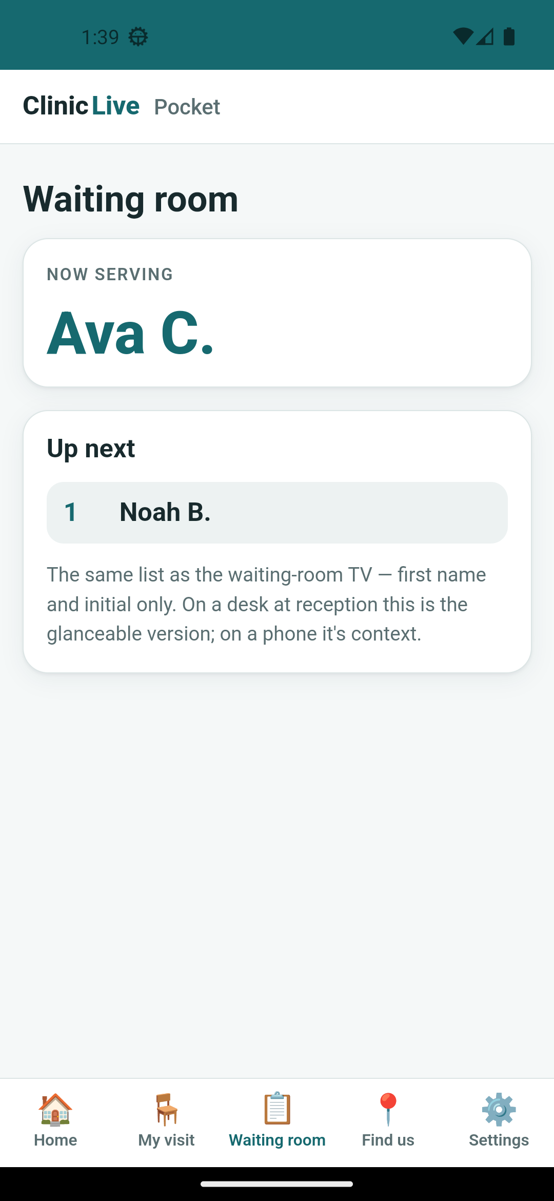 Phone
PhoneOne note for the browser host that the log insisted on. The web host holds one hub connection for the whole process and shares it across every visitor's circuit — a fan-out singleton. For a public board that's ideal; it's also a thing to remember before anyone puts per-user state on that connection.
The toast that stayed open
This is the part where a Windows post would normally show a notification banner. It can't.
Part 5 left Windows toasts open:
Register() succeeds, the OS setting reads Enabled, Show() returns
without complaint, and no banner ever appears — and a toast sent to the same identity from
PowerShell is just as silent while PowerShell's own banners work. The diagnosis, now that
the desktop part is here, is identity. An unpackaged debug build has no package
identity, and Windows is entitled to suppress notifications from an app it can't name.
There are two real fixes, and both are ship-time work: package the app as MSIX, or have an
installer create a Start-menu shortcut carrying an explicit AppUserModelID. Neither belongs
in a debug build, so both are Part 11's
problem — and Part 11 will be honest about how far it gets.
What the AI got wrong: nothing in this part's code, which is itself the entry. The mistake this part pays for is older: in Part 2 the AI's default Windows window opened maximized with the phone layout inside it, and "it compiles for Windows" got reported as if it were "it runs on Windows." A desktop app you get for free isn't a desktop app; it's a phone in a very large frame. And on toasts, the honest record is that the AI's Part 5 diagnosis chased the registration code — moved it, re-ordered it, re-registered it — when the answer was never in C#. Some problems are about who the OS thinks you are, and no amount of code changes that.
The meter: ≈ $6.50 on season three's running meter. The cheapest part of the season by some distance: forty lines of CSS, ten of C# and one page. The resize-and-reshoot proof cost more than the code did, which is the right way round.
Checkpoint: git checkout pocket-10 in
the repo: build the Windows
target and the window opens at 1100×760 with a rail; drag it narrower than 900 pixels
and the tabs come back. Run the web host and widen the browser — same rail. Tap Waiting
room on any host and call next from the staff page; it moves. Toasts on Windows still
don't show, and the app will tell you "Allowed" while not showing them. 28 tests green.
Three hosts, one set of screens, every capability answered honestly — and none of it shippable. The Android build is signed with a debug key, the Windows exe needs a developer's machine, and CI doesn't know the app exists. Time to make it real, and to be plain about the one thing that stays unpackaged: Part 11: Ship It: Signed Android, Self-Contained Windows, CI for Both.